From park tennis to indie rock lyrics: 7 newspapers we love in April
Every month, we comb through hundreds of newspapers and pick a handful that we're most excited about to share with you. Here’s what's...
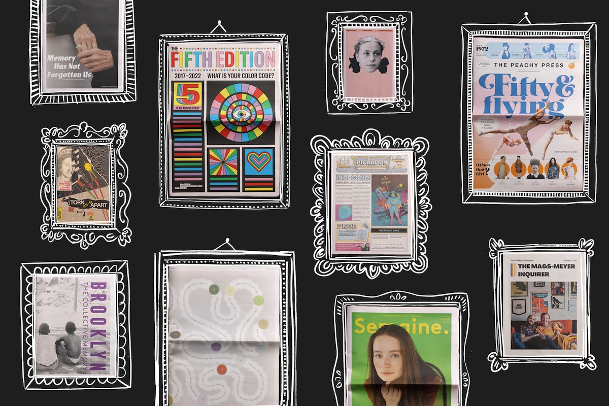
At the end of ever year, we look back at all the exciting projects that went through our presses over the past 365 days and highlight a handful that stood out. This year we printed over 2.6 million newspapers, so had plenty to choose from!
From a catalogue of punk ephemera to a 50th birthday broadsheet to a collection of stories from the Asian Canadian diaspora – here are 10 publications that show what a newspaper can be today. We can't wait to see what's in store for 2023!
Listen here
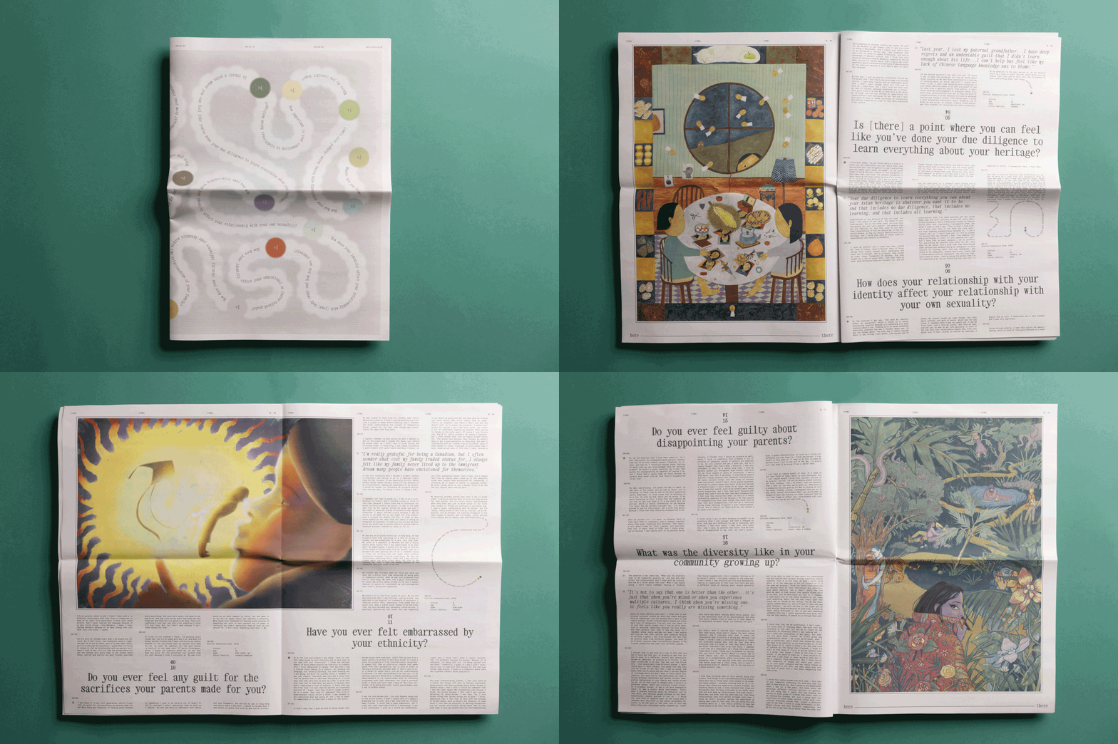
The here-there audio archive is a community arts project sharing experiences from the Asian Canadian diaspora. In June they hosted a pop-up ‘listening room’ exhibition at the Whippersnapper Gallery in Toronto – this digital broadsheet features transcripts of nineteen audio stories alongside illustrations by Brian Jiang, Thamara Perera, and Lilian Sim.
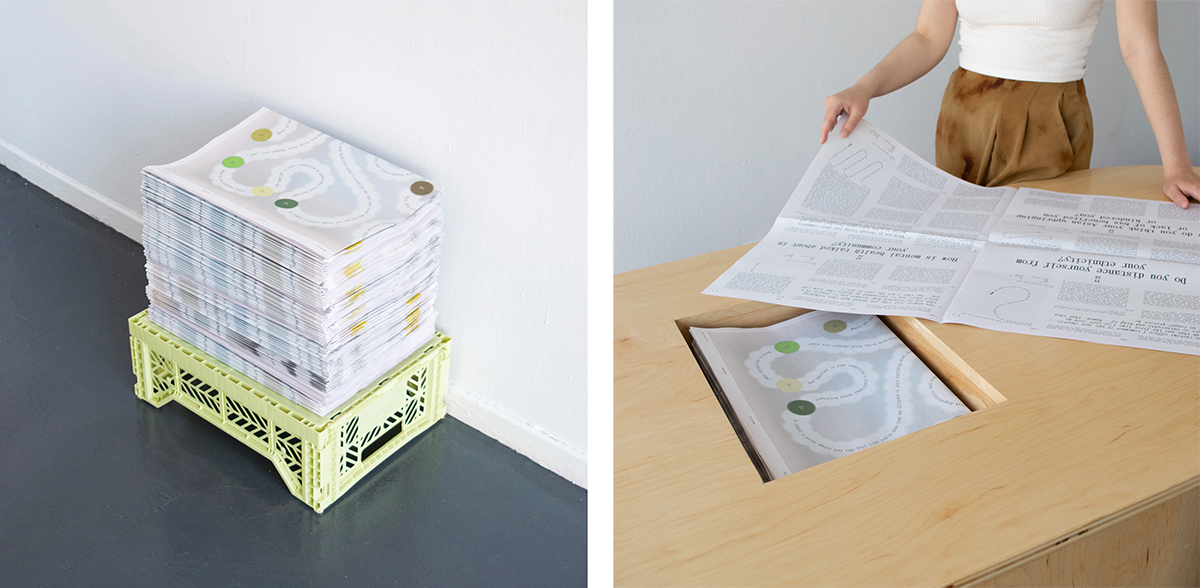
“The newspapers were distributed for free to encourage meaningful discussions around the topics of home and identity beyond the life of the exhibition,” say designers Michelle Kuan and Emi Takahashi. “The familiar format made our exhibition more accessible and allowed us to connect with people who wouldn’t normally engage with the arts.”

Past present
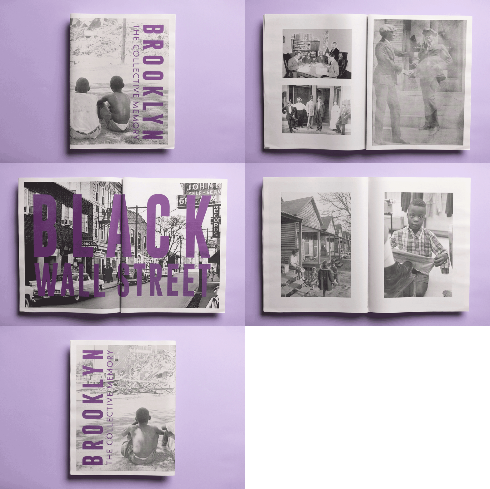
As part of the Charlotte International Arts Festival, creative agency Ronin House Studios organised an exhibition commemorating North Carolina’s once vibrant ‘Black Wall Street’ community known as Brooklyn. Designer Lorenzo Diggins created this digital tabloid to accompany the show, featuring rarely-seen archival imagery of former Brooklyn residents.
“What I like most about the newspaper format is how experiential it is,” says Lorenzo. “You’re more present when flipping through it. And from a designer’s perspective, I love how the size gives me so much more liberty with the layout.”

Hey, punk!
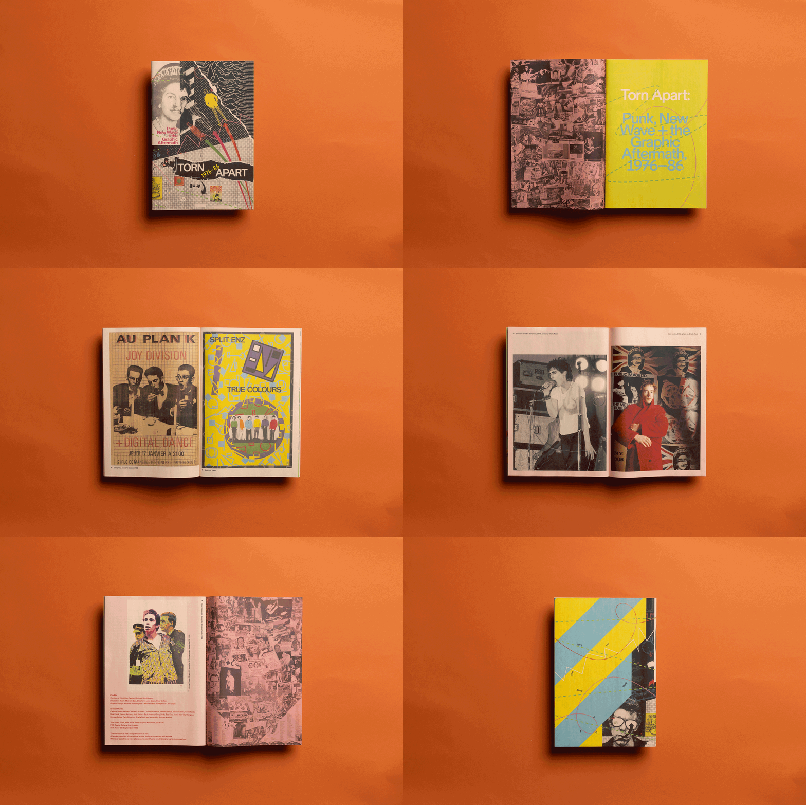
This zine was the free catalogue for Torn Apart, an exhibition of punk and new wave graphics shown at the Pacific Design Center in Los Angeles this summer. It featured around 1,000 pieces of graphic design ephemera produced from 1976 to 1986, including posters, flyers, publications, clothing, stickers and buttons.
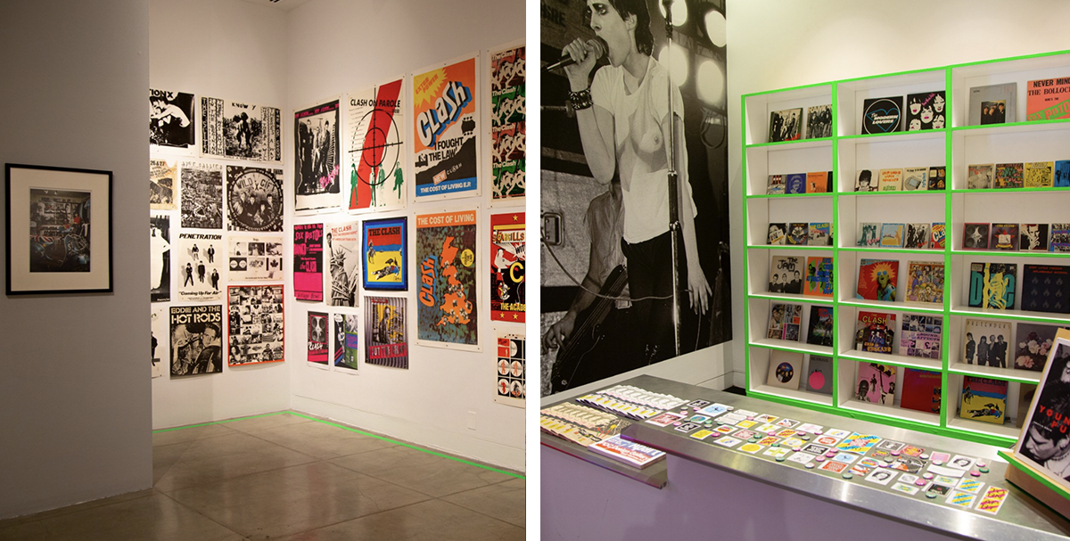
“The zine format was perfect for the fast, do-it-yourself aesthetic of punk” says designer Michael Worthington, who worked with Stephanie Lane Gage and Michelle Bac to create the digital mini zine. “We printed three different versions as each run got gobbled up really fast!” (The one shown here is printed on our salmon newsprint.)

Nifty fifty
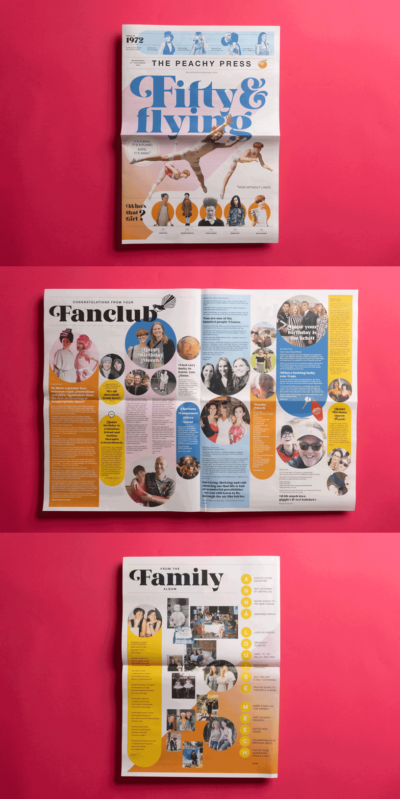
Hip hip hooray for avid aerialist Anna, who turned fifty this year. Her pal Bob van Bekkum, a creative director, collected messages and photos from friends around the world for this special edition broadsheet all about her first half-century.
“A newspaper is such a tangible keepsake and sat well with Anna’s love of retro,” says Bob. “When she first received the stack of papers, it took a moment for Anna to realise it was all about her and not something generic about her birth year. It was quite emotional!”

Creative couple
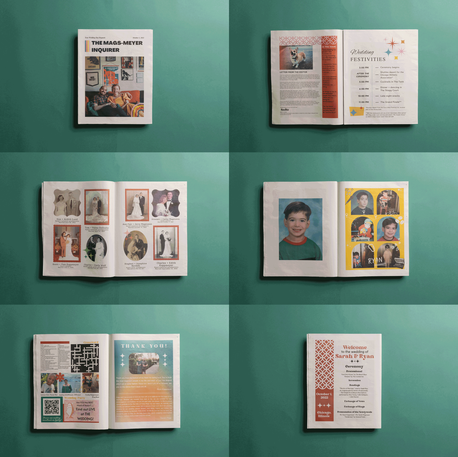
“Making a newspaper was one of the most engaging and energizing parts of wedding planning,” says writer (and newlywed) Sarah Magnuson. Sarah and Ryan got married in October and used tabloid programmes to set the tone for their unconventional ceremony. Guests grabbed their copies from a bona fide newspaper dispenser, complete with custom Mags-Meyer Inquirer logo. On the first page was a letter from the ‘editor’ – Sarah and Ryan’s corgi, Rodeo.
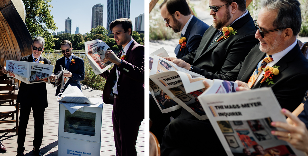
“There's so much you can do with the newspaper format,” says Sarah. “Having the creative license to include a Spotify playlist link, spreads of family photos and a crossword puzzle was ideal for our hyper-personalized wedding. I can't tell you how big I smiled when the newspapers arrived!”

Tasteful times
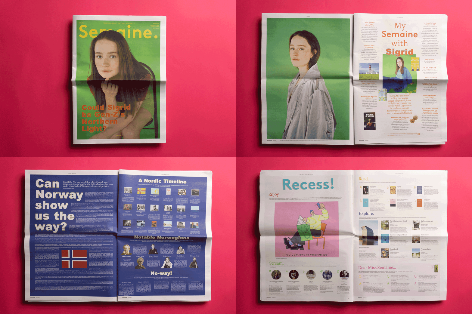
“The world’s most tasteful newspaper” is the slogan of Semaine’s newly launched print publication. Debuting with Norwegian singer Sigrid on the cover, the digital broadsheet will delve into the world of a different tastemaker each month.
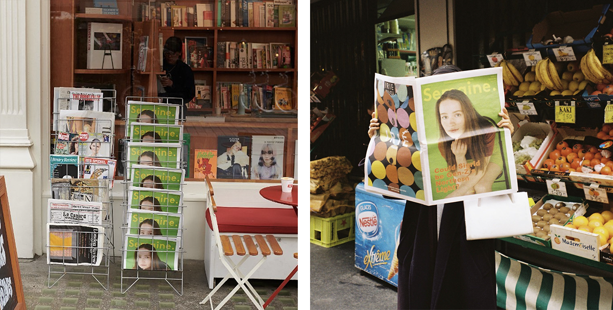
“What we love about the newspaper format is that it feels like a companion as soon as you hold it,” says Semaine founder Michelle Lu. “You feel welcome to roll it up, put it under your arm, read it in bed. It encourages you to slow down and savor the ritual of reading.”

Puzzling pages
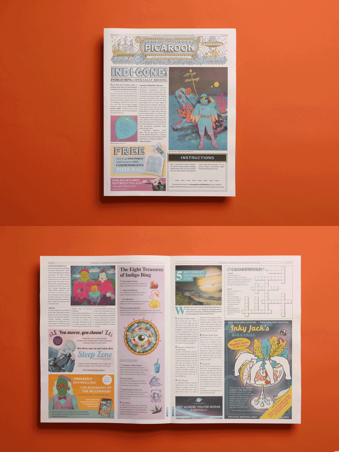
The Picaroon may look like a normal newspaper, but it’s actually filled with secret messages and clues as part of a puzzle pack from children’s magazine AQUILA. The escape room-style game puts kids’ pattern-spotting, codebreaking and lateral-thinking skills to the test as they race to save a space pirate from an intergalactic criminal gang.
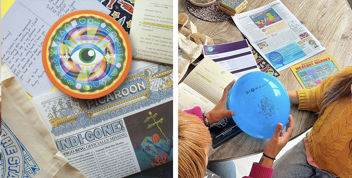
“Our customers have really enjoyed looking for clues in the newspaper, but they also enjoy it as something to read in its own right,” says deputy editor Benita Estevez. Printed on our traditional tabloid.

Designer discovery
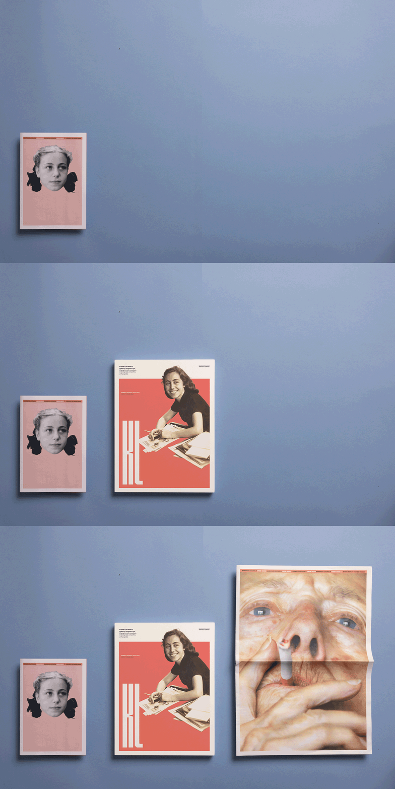
Using all three of our newspaper sizes, designer Faride Mereb shares the life and work of Karmele Leizaola, the first woman to work as a graphic designer in Venezuela. Supported by a grant from 10x10 Photobooks, Faride studied Leizaola’s archive for over a year to produce a 3-part publication: the broadsheet opens up into a timeline and the tabloid and mini feature scans of Leizaola’s (rarely seen) work, organised by time period.
See how the newspapers come together in Faride's flip-through video:
“Karmele Leizaola was a newspaper designer, so reproducing the work in this format was really important for me,” says Faride. “And given the current state in my home country of Venezuela – with government censorship and the military taking control over media – I wanted to vindicate the printed word.”
Faride is giving a lecture on the project next year and in the meantime the publication is being distributed to bookshops, galleries and archives (including the wonderful Herb Lubalin Study Center). She also recently held a solo show (alongside Sheryl Oppenheim’s ‘Book Related’ exhibition) in New York. “This is just the beginning,” says Faride.

High five
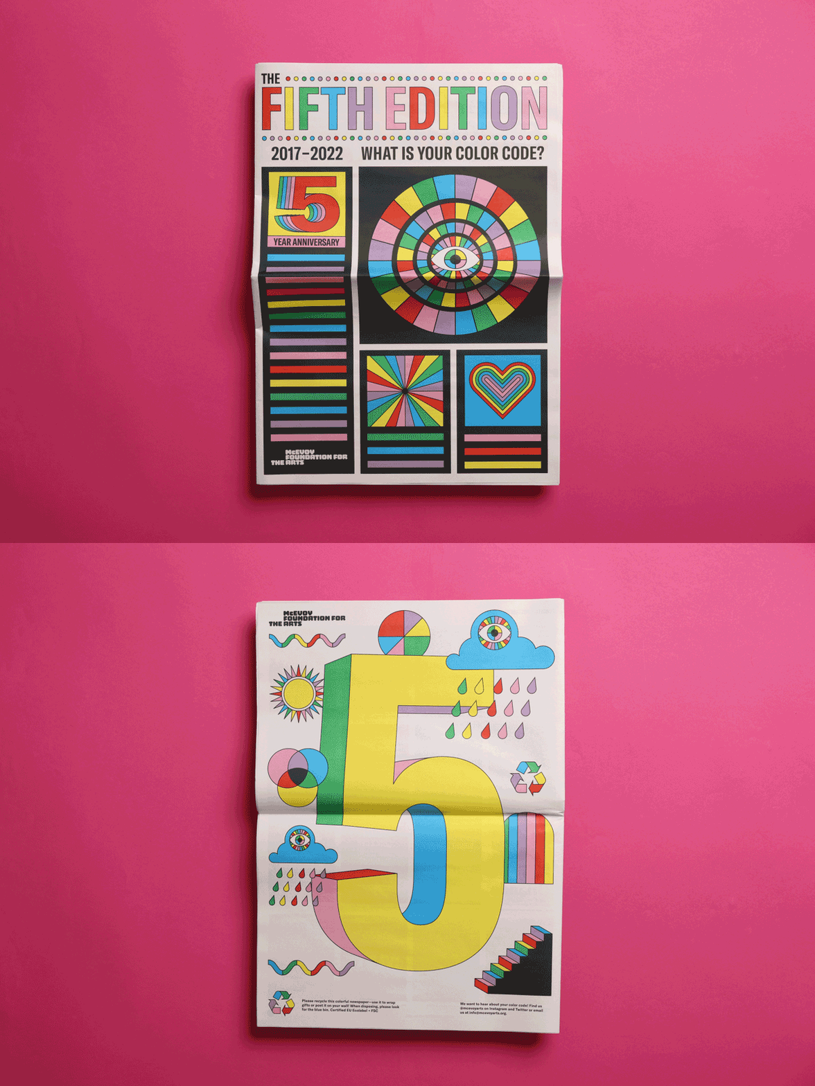
The Fifth Edition is a one-off publication created by McEvoy Foundation for the Arts in San Francisco. The digital broadsheet, printed to celebrate the organisation's fifth anniversary, features five original posters from the artists behind McEvoy Arts' first five years of exhibition posters.
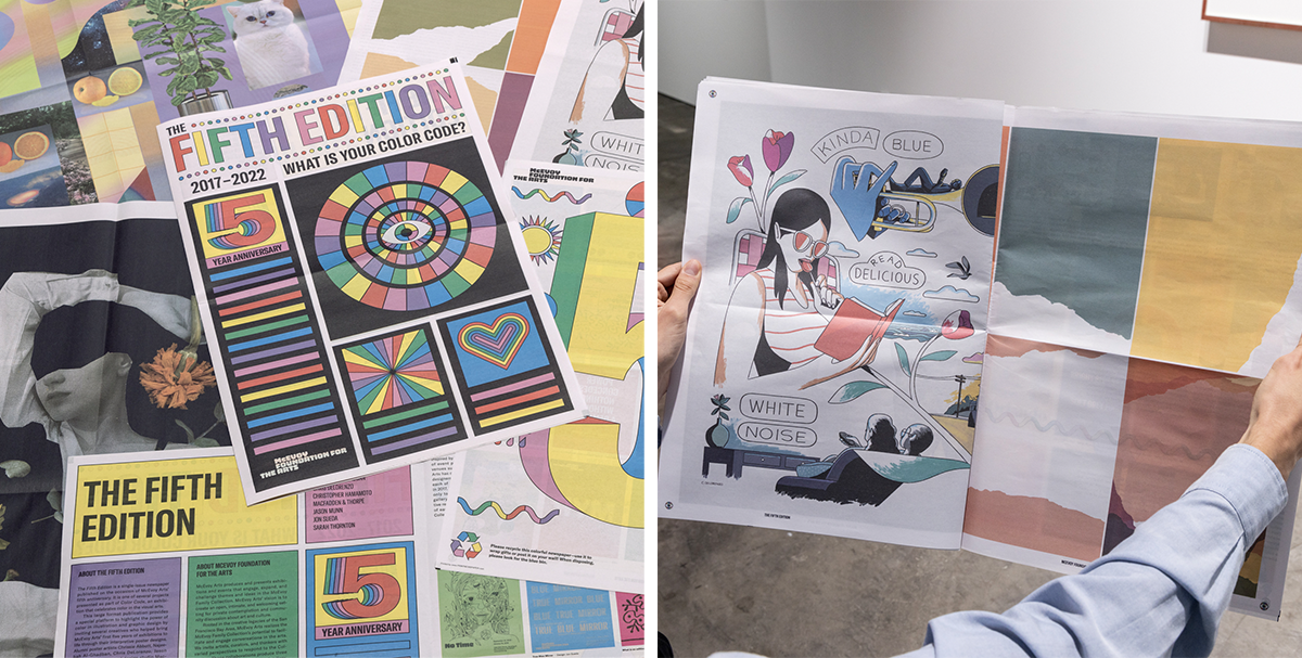
"The newspaper has given the Foundation a fun new platform to talk about their work, history and the artists in their community," says Scott Thorpe of Macfadden and Thorpe, the creative agency that designed the newspaper. "It’s also putting in work as a promotional piece and attracting new audiences to check out the Foundation. People arrive at the gallery with The Fifth Edition already in hand and say the newspaper convinced them to come visit!"

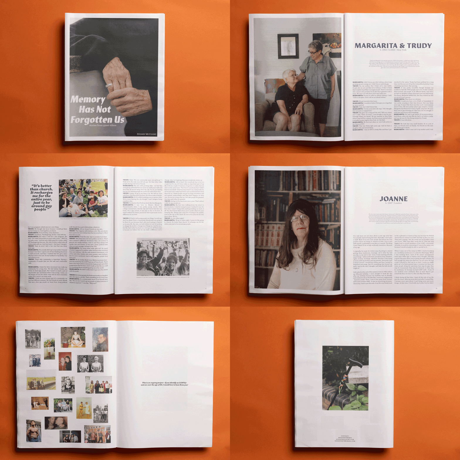
Aging archive
Sydney McCourt produced this digital tabloid as part of her final major project for a Masters in Photojournalism and Documentary Photography at UAL. Through a series of intimate portraits and interviews with 10 LGBTQ+ people over the age of 60, Sydney aimed to “create a picture of queer aging and contribute to the collective queer archive.”
“I pursued a personal search for queer elders, hoping to create that community for myself,” she explains. “I chose newsprint as a response to the history of queer people's stories being left out of mainstream media. It's an ongoing project, so I'm planning on this newspaper just being the first iteration of it.”

Every month, we comb through hundreds of newspapers and pick a handful that we're most excited about to share with you. Here’s what's...
Every month we choose a handful of newspapers that stood out and ask the people behind them to tell us more. Here’s what caught our eye...
Every month we pick out newspapers that catch our eye and ask the people who printed them to tell us more. Here’s a peek at what we’ve...