
Risograph postcards and vintage football: 8 Newspapers we loved in May
Each month, we look back through the thousands of newspapers we’ve printed and pick some favourites to share. Here’s what's stood out in...
Every month, we print hundreds of exciting, creative, well-designed newspapers and put together a roundup of our favourites.
Below, some of the newspapers that stood out in February: a portfolio from a design studio that creates dreamy window displays for Hermès, a zine exploring failure and a souvenir poster from a fictional race track.
Traditional mini printed on 55gsm improved newsprint
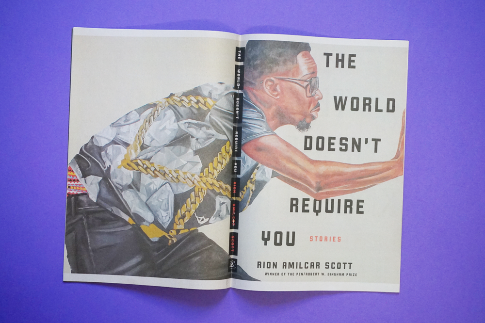
The World Doesn’t Require You, an upcoming short story collection by Rion Amilcar Scott, is set in the fictional town of Cross River. Using our traditional minis, publisher Liveright created The Cross River Review to transport readers to this world.
“We loved the idea of creating a publication from Cross River and including 2 of the stories from the book,” says designer Steve Attardo. “I wanted it to be part literary journal, part New York Times Magazine inspired.” The newspaper will be distributed at bookstores across the US to promote the book.
Digital broadsheet printed on 55gsm improved newsprint
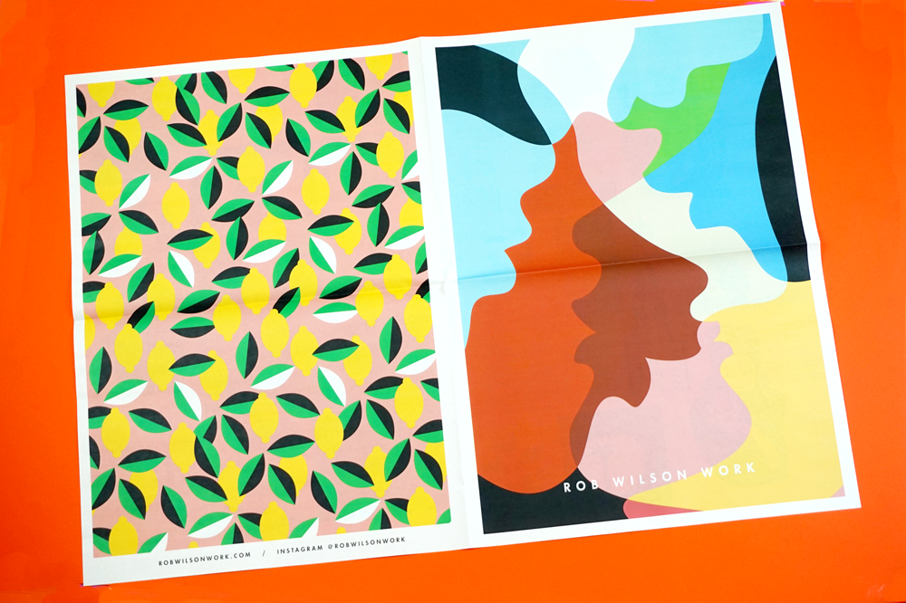
To accompany a talk and exhibition at Brookhaven College in Dallas, Texas, illustrator Rob Wilson created a newspaper for students to take away. "It gives a quick visual read of my recent illustrations in a bold, fun way," says Wilson. "My work is diverse in style, and I wanted to show that collectively—and conceptually—it works together. I hope students will find some inspiration in my creative efforts as they pursue their design education."
Traditional tabloid printed on 55gsm improved newsprint
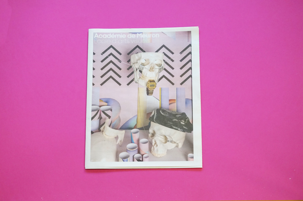
This newspaper for Académie de Meuron, a preparatory art school in Neuchatel, Switzerland, highlights diverse student projects—from sculpture to photography to painting—and provides information for prospective students. During the academy's open days last month they plastered the pages of the newspaper onto the wall as a spatial installation!
Digital tabloid printed on 90gsm bright paper
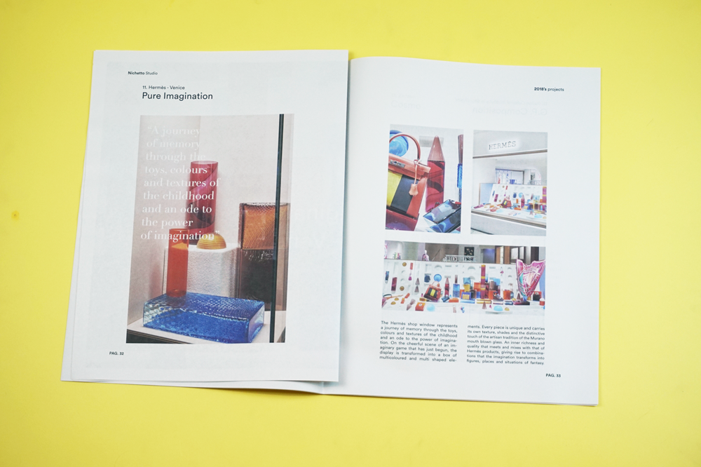
Stockholm-based Nichetto Studio printed this journal to share work highlights over the past year, including furniture designs for Arflex and Fogia and dreamy window displays for Hermès in Venice and Hong Kong. “We were really impressed by the fast turnaround and the quality of the printing,” they told us. “It made our work shine that much further.” Design by Neni Studio.
Traditional tabloid printed on 55gsm improved newsprint
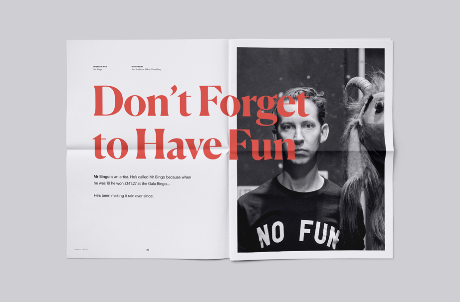
Published by Brighton-based Curate Labs, Annual Digest is a series of short thought pieces and reflections to inspire entrepreneurs and young professionals for the year ahead. “We decided to create Annual Digest as an extension of our studio, Curate Labs,” explain founders Abb-d Choudhuryand Sara Scobie. “The newspaper unveils processes and relationships within modern businesses. We want to share smart lessons from those who have been through it.” Featuring interviews with creatives including Kimi Gilbert, Hamish Makgill and Mr. Bingo (pictured above). Find local stockists to get a free copy.
Traditional tabloid printed on 52gsm recycled newsprint
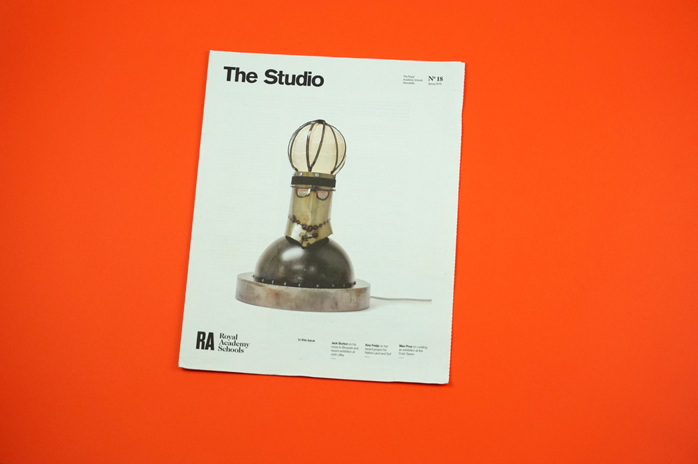
The Studio was founded as a digital newsletter in 2011 to feature interviews and projects by artists from the Royal Academy Schools in London. With sponsorship from designer Sir Paul Smith, it became a physical newspaper in 2014. "We always have to think about what artworks will look best," says founding editor Jonathan Stubbs. "In this issue we're lucky to have a striking cover image by Kira Freije. The RA Schools is 250 years old this year — The Studio still has a lot to cover!" Design by Matt Hunt.
Traditional tabloid printed on 70gsm improved paper
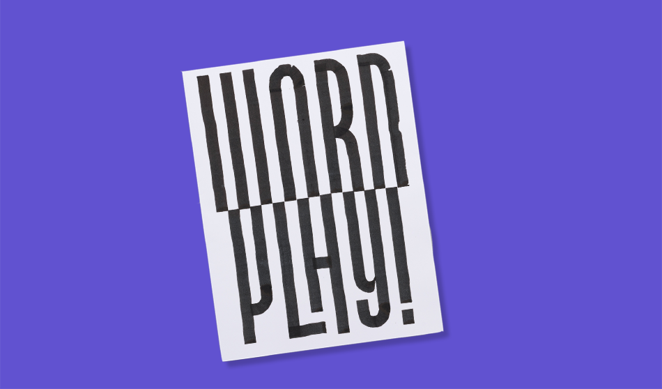
Dutch designer Guido de Boer recently had his first solo exhibition, WORD PLAY!, at Alley Gallery in Belgium. Using hand lettering, de Boer Guido creates visual puzzles that bend the rules of type and play tricks on the eye. "I took this momentum of my exhibition to make a newspaper and combine the content of the exhibition with some previous projects," he tells us. "It serves two purposes: gives visitors to the exhibition some background on the works on display and provides an overview of my projects over the last five years."
Digital tabloid printed on 55gsm improved newsprint
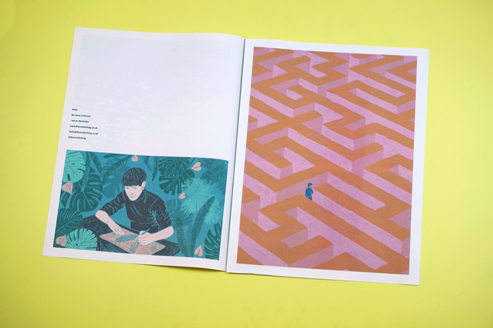
Since graduating from Middlesex University in 2012, freelance illustrator Dionne Kitching has worked for clients like Urban Outfitters, End of the Road Festival and CICO Books. "It can be hard as an illustrator to stand out from the crowd and to get art directors to notice you," she says. "I loved the idea of sending out a newspaper portfolio—something other than an email, that would be fun to open and that people might even want to keep! It’s always amazing seeing your work in print and I really like the quality of newsprint."
Digital tabloid printed on 90gsm bright paper
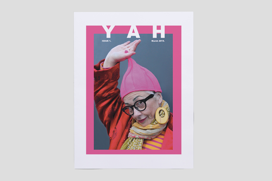
YAH is a new publication celebrating "the mature generation of women who still look and feel Young At Heart." Spotlighting boundary pushers, the first issue features interviews and essays about style, work and the freedom of getting older—"after 18 months of retirement, I can honestly say I’m happier, healthier and fitter than ever before!" as one interviewee puts it.
Digital tabloid printed on 55gsm improved newsprint
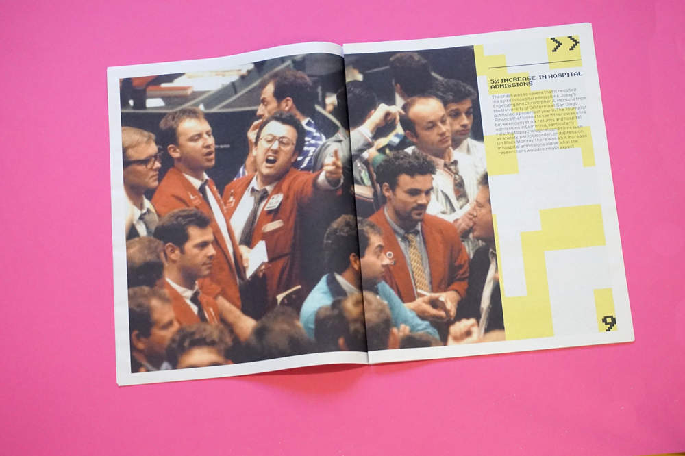
Black Monday is a university project from Tom Astbury, a graphic design student at UWE Bristol. Using a combination of text and archival imagery, the newspaper examines "illusions of value" by looking at the stock market crash of 1987 known as "Black Monday."
"A newspaper fit the style and time of the photographs really nicely," Astbury says. "The publication will accompany another project, where I've imagined what a physical stock share would look like. The idea is to attach some physicality to the value that stocks have."
Digital broadsheet printed on 55gsm improved newsprint
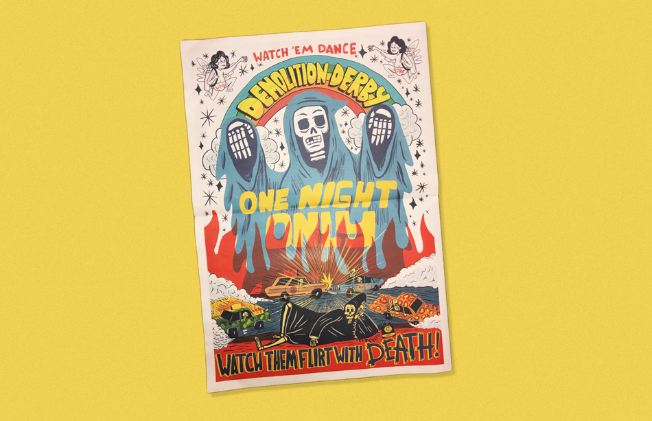
Illustrator Grant Kratzer, AKA Cheatin' Snakes, created this newspaper as a souvenir from a fictional race track. It's inspired by a track in the small Wisconsin town where he grew up, but Kratzer hopes people will create their own stories around the zine.
"I primarily design for screen printing and Risograph printing, which both limit the amount of color you can use," says Kratzer. "With a newspaper I could use as many colors as I wanted which I felt was a huge plus. And I loved being able to work really large and add a lot of detail to the center spread."
Kratzer took the title "Raw Power" from a 1973 album by The Stooges."I felt like that album would be a fitting soundtrack to the scenes from the newspaper."
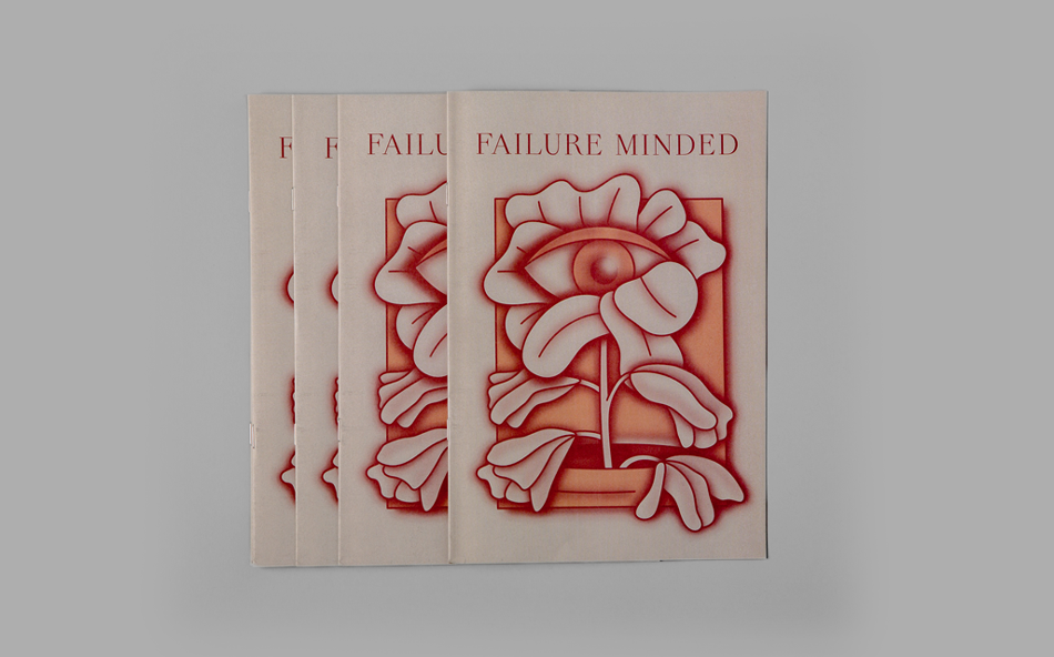
Depending on who you talk to, failure can either be seen as a necessary stepping stone on the road to success or viewed as a crippling obstacle that must be averted at all costs. This zine aims to better understand the duality of failure by exploring how taking risks and fearing failure has affected successful people throughout history. Design by Garrett Prince with copywriting by Andrew Richdale and photography by Chris Behroozian.
Print your own newspaper with Newspaper Club.
Each month, we look back through the thousands of newspapers we’ve printed and pick some favourites to share. Here’s what's stood out in...

Welcome to our April roundup! Every month, we pick a handful of newspapers that we're excited about to share with you. Here’s what's...

Every month we choose a handful of newspapers that stood out and ask the people behind them to tell us more. Here’s what caught our eye...