
Risotto collects 400 joyful risograph postcards into a newspaper
Glasgow-based risograph studio Risotto has brought a global postcard project – featuring 400 illustrations by over 100 artists – together...
Since graduating from the Cooper Union with a degree in Graphic Design and Animation this spring, New York-based creative Myunghee Kwon has kicked off her career designing book covers. She’s already worked with publishers Bloomsbury and FSG – look out for titles featuring her covers on bookshelves starting next year.
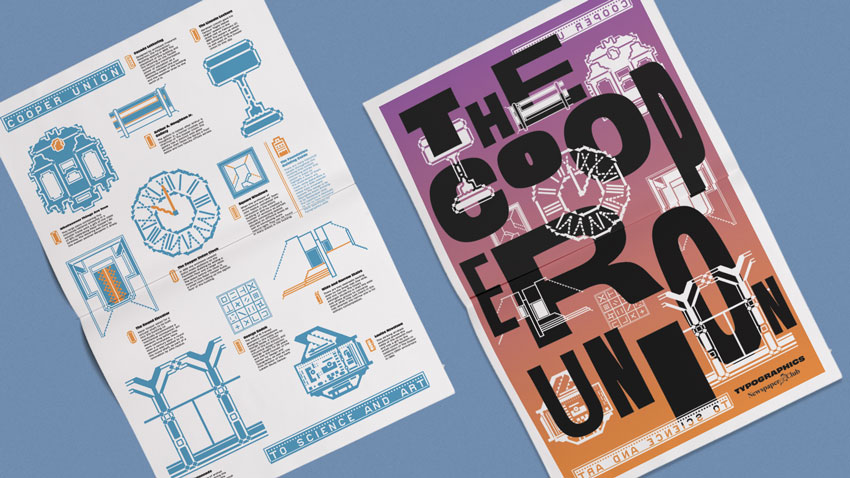
One of Kwon’s last projects as a student was a newspaper for the Cooper Union’s Typographics design festival. While Typographics explores the future of typography, Kwon’s design looks back on the history of the 160-year-old Foundation Building where the event is held.
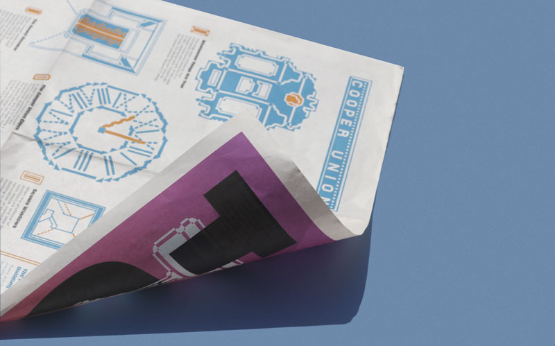
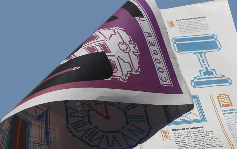
Printed as a digital tabloid, the single sheet newspaper folds out into an illustrated poster showing hidden design details around the building, like a sculpture by artist Louise Nevelson and an unusual round elevator. Kwon painstakingly produced each illustration using Alpha-Blox, a modular type system first introduced in 1944 – it took over 50 hours to finish them all!
Below, Kwon walks us through the experience of making the newspaper, from researching the 11 historic details she illustrated to the feeling of seeing people interact with her work at Typographics.
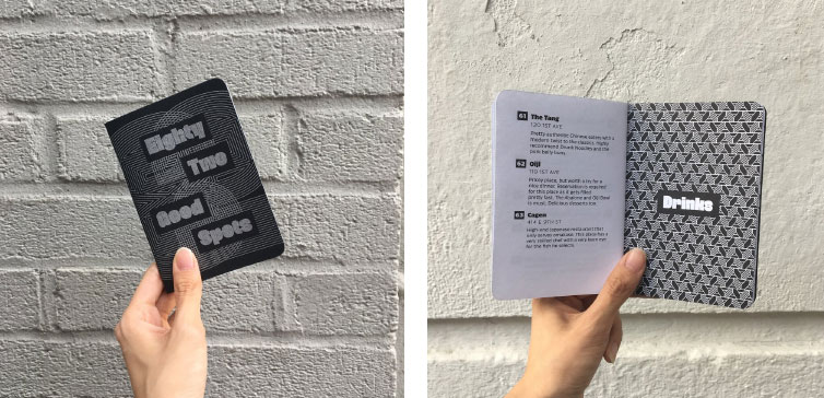
I’ve been involved with the Typographics design team since 2018. Last year I designed a guide to “Eighty-Two Good Spots” around the East Village (printed as a Scout Book!) for people who would be in the neighborhood for the festival. It featured places to get coffee, ice cream and lunch, all recommended by the Cooper Union community.
This year I worked more broadly on branding for the conference. The identity was based on gradient and variable fonts and I had to work within this theme for the newspaper. I was given a lot of creative freedom – my only limitation was that I had to use newsprint but that didn’t really restrict my creative process.
Initially I planned to make another guide to New York City, expanding beyond the East Village this time. But in the end it felt redundant to make another guidebook.
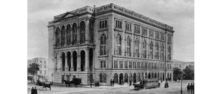
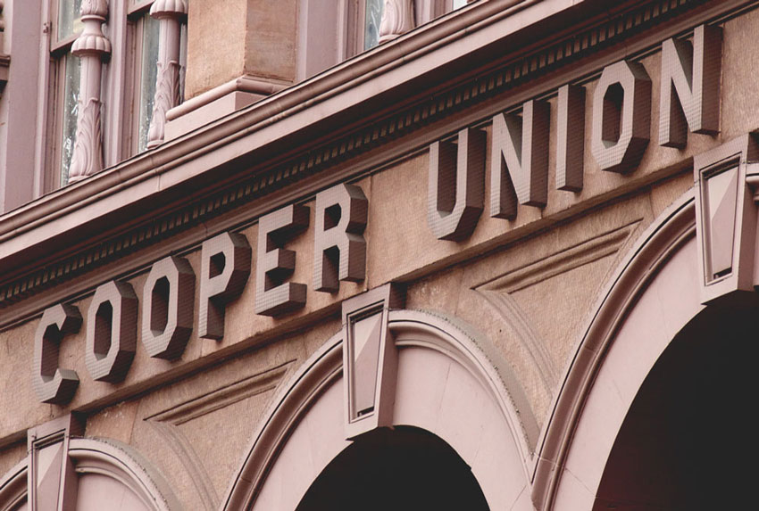
Instead, I decided to create a map of historical details found around the Cooper Union’s Foundation Building, which first opened in 1859. The building has a rich and interesting history that includes Abraham Lincoln giving a speech in the Great Hall in 1860.
Before this project, I was vaguely aware of interesting details around the building but I discovered many more during my research process.
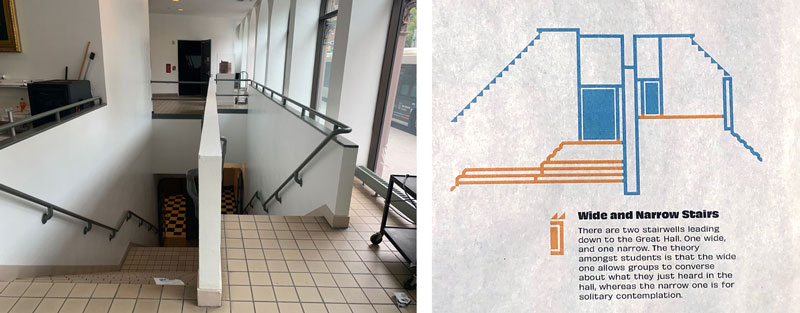
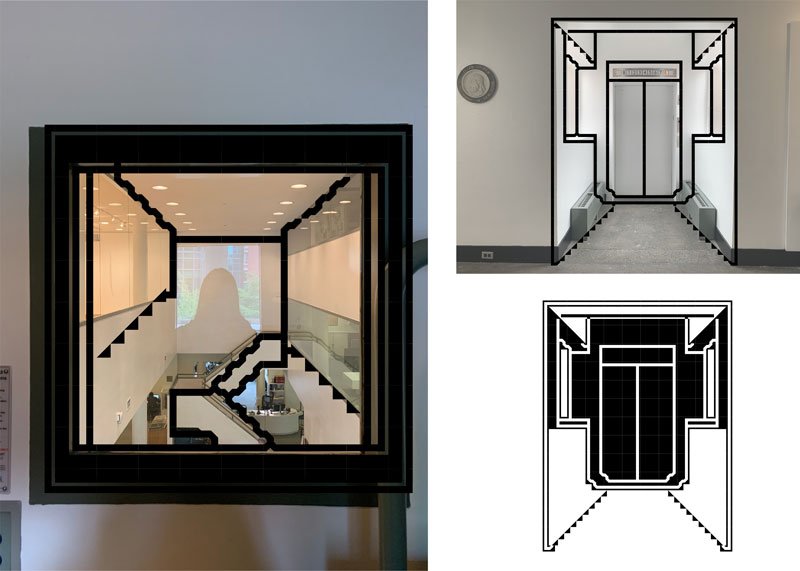
For example, there are two stairwells leading down to the Great Hall – one wide and one narrow (shown below). The theory amongst students is that the wide one allows groups to converse about what they just heard in the hall, and the narrow one is for solitary contemplation.
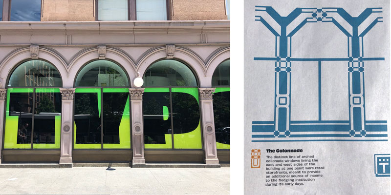
I also found out that the Colonnade windows on the east and west sides of the building (shown below) were at one point retail storefronts, meant to provide an additional source of income to the fledgling institution during its early days.
I consulted some historical material about the building in the Architecture Archive at The Foundation Building. Steven Hillyer, director of the Architecture Archive, helped me with the contents and Sasha Tochilovsky [Curator of the Herb Lubalin Study Center of Design and Typography] gave me guidance and feedback on the design and copywriting as well.
This was my first experience using newspaper for a design project (before this, I’d only used it in drawing classes). To differentiate this guide from the book I made last year, I decided to present the map as a big fold-out poster on a single sheet of newsprint, using Newspaper Club’s digital tabloid.
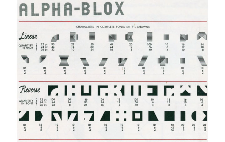
I was inspired to use Alpha-Blox after discovering them in the letterpress printers at the Foundation Building (pictured below). I wasn’t very familiar with their use, I only knew that they were elements of letterpress printing and I was visually drawn to the pattern they could create.
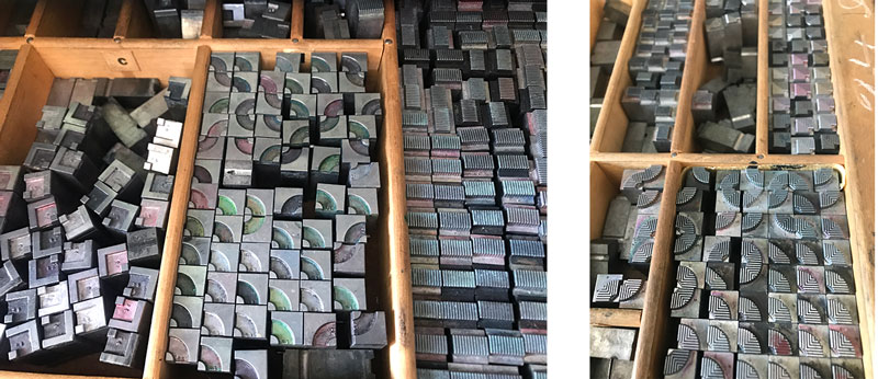
I used "P22 Blox" by P22 Type Foundry, designed by Richard Kegler, based on the American Type Founders 1944 modular metal type ornament system.
I started by moving the Alpha-Blox around on top of the reference pictures I had taken of historic details around the building. I used 73 individual Alpha-Blox and it took 51 hours to complete all the illustrations.
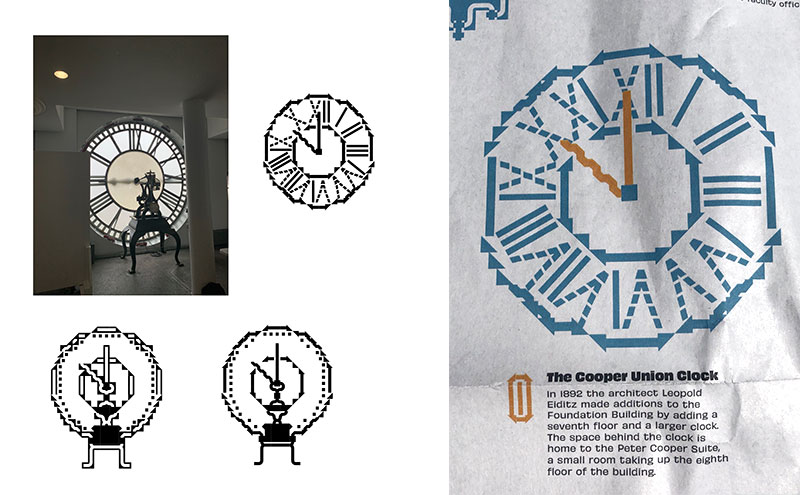
The most difficult illustration to create was the Cooper Union Clock (pictured below) – it was hard to make the circle look like a circle!
It was great (and also a bit weird!) to see people actually holding my design at Typographics and their surprise when they found out that the illustrations were created with Alpha-Blox. Lots of people asked how long it took to make them.
To be honest, I never really thought about the history of the building I spent so much time in when I was a student at the Cooper Union. I wish I’d done this project before I graduated so I could have appreciated all those little details more when I passed them by. Hopefully, I’ll be able to work with Typographics again next year and learn about even more!
Print your own newspaper with Newspaper Club.
Glasgow-based risograph studio Risotto has brought a global postcard project – featuring 400 illustrations by over 100 artists – together...

More than 150 photographers gathered in London last week for Photo Meet, an annual portfolio review that brings together photographers...

Email newsletters weren't cutting it for photographer and creative director Max Hemphill. "Most of my outreach got lost in inboxes," says...