
How to create a newspaper with free Canva templates: a step-by-step guide
If you’re looking to create a newspaper using Canva, you’re in the right place. We've been helping creative folks design and print custom...
Described by art director Steven Heller as “the plumbing-parts catalogs of graphic design,” printed type specimens contain an extensive catalogue of letterforms for typographers to show to their prospective clients. They can be straightforward booklets or exercises in creativity, featuring bold designs and playful content.
At Newspaper Club we’ve printed type specimens of all, er, types! From student projects to professional portfolios to hand-outs for festivals and even one for the New York Times Magazine.
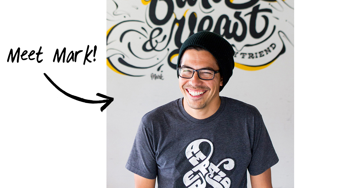
Mark Caneso is an award-winning designer and typographer based in the US, working on everything from magazine covers to product packaging with clients like Airbnb and Adobe. He’s been printing type specimens with us since 2015 and has tried all of our different formats (and several different paper stocks) along the way.
“There’s a special quality to newsprint," he says. "It’s not so precious that you don’t want to dive in. It can be both practical and beautiful."
Below, Mark shares what he’s learned about creating type specimens — from mocking up a dummy copy first to choosing the right colour palette — and how he uses print to boost traffic to his online shop. (Plus scroll to the end for his reading recommendations for type lovers!)
Getting started
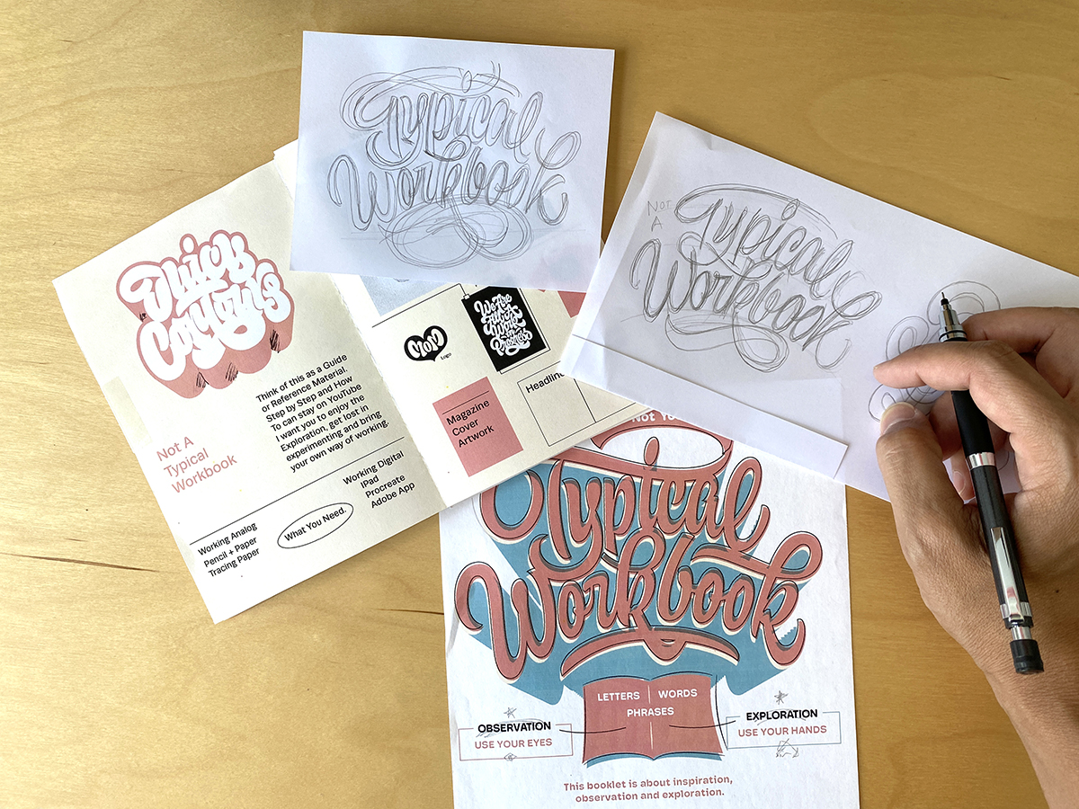
I’ll usually make a paper dummy — I like to print small thumbnail folios (pictured below) to plan out the pages. Getting the feeling in my hand early helps me visualize what I want the paper to be. Working off-screen in this way also helps me plan the pacing from spread to spread and gives me a better sense of how the final piece will be experienced.
"Working off-screen helps me plan the pacing and gives me a better sense of how the final piece will be experienced."
When it comes to content, I curate the art to showcase a nice variety of work. I think about my type specimens as something a fellow designer might purchase, but also as promotional pieces I can send to clients or agencies to introduce myself and highlight my skills.
Picking a format
I’ve printed on each of Newspaper Club’s sizes: mini, tabloid and broadsheet.
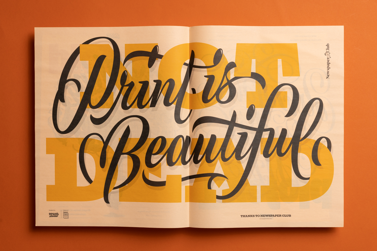
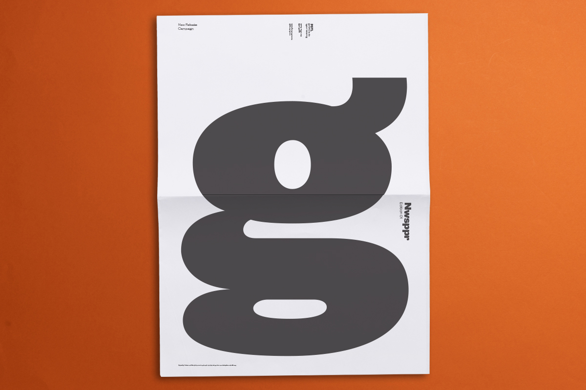
One of my first prints was on the biggest format, the broadsheet. I made a specimen for my typeface Campaign (pictured below) and wanted to show off some letters as big as possible. The front and back cover was a single lowercase letter g printed at 700mm x 500mm:
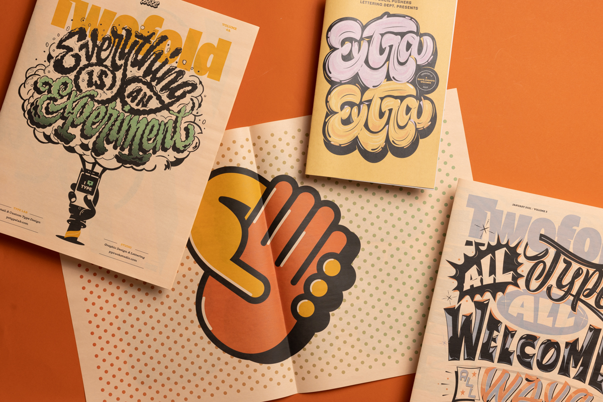
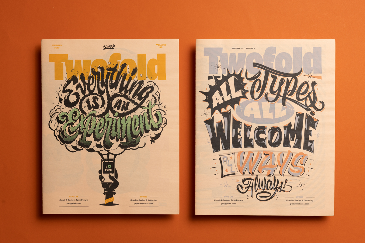
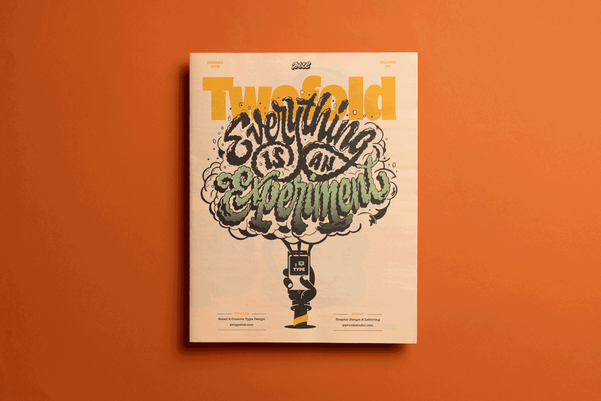
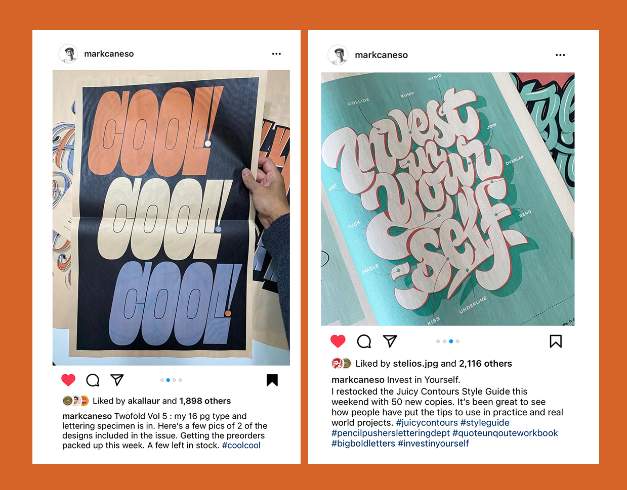
The tabloid hits that sweet spot between small and large. I’ve taken advantage of the double-page spreads to make posters for Twofold type specimens (pictured below). I’ve created 5 volumes — one every year since 2016.
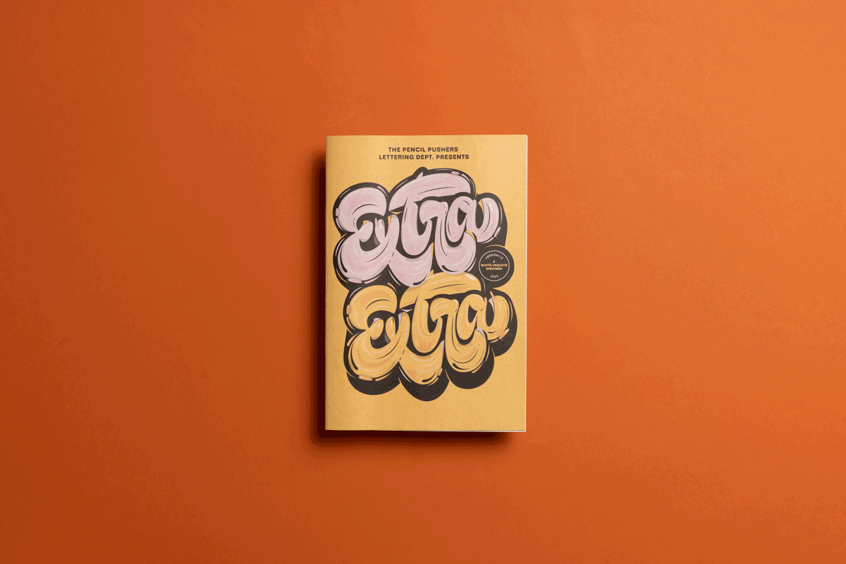
The smallest size, the mini, is a perfect size for my workbooks — like my recent Extra Extra workbook (pictured below). It’s big enough to allow for fine details to shine but small enough to hold comfortably or leave out on a desk.
Choosing a color palette
I tend to keep my colour palettes simple. Just because you can print every colour doesn’t mean you need to!
Even if I’m printing CMYK I think about it like I’m using spot colours. With my Twofold series (pictured below) I’ve tended to print black and one or two other colours per issue.
Printing on salmon newsprint has been one of my favourite options because the paper gives you an additional colour to think about. It’s fun to explore how you can use the paper colour in the design.
"There's a special quality to newsprint. It can be both practical and beautiful"
It’s a good idea to order Newspaper Club’s free sample pack to see how colours look on different paper stocks. And make sure to read their artwork guidelines for advice on getting the best results.
Printing a test copy
I love that you can print smaller quantities starting from just 1 copy. Getting a single print to photograph or proof how your colours appear in print can be really useful.
Sharing your type specimen
I often share my newspapers on social media. I like to tease them out before releasing them — it’s a great way to gauge interest in something you’re working on. I have an online shop with a lot of other type-related goodies, so I always want to pique people’s interest to check out the shop.
Running an independent store is a lot of work. It’s really a labor of love. I think of the shop as a promotional avenue for people to find my lettering and type design. I smile when an order comes in because the recipient wants the thing I made. That is the best part of it.
"I think of the shop as a promotional avenue for people to find my lettering and type design."
The worst part is packing and shipping because it always takes more time than I expect (Editor’s note: check out Newspaper Club’s guide to packaging different newspaper formats!) If you catch me on a good day I’ll spend a solid amount of time making sure the order looks great. I have custom tissue paper from Noissue to wrap the pieces and I make the presentation look good (pictured below).
Often though, because of time constraints or other factors, I'll simply take a piece of chipboard for added protection and drop it in a sturdy mailer with a few extra goodies and call it a day. That still does the trick!
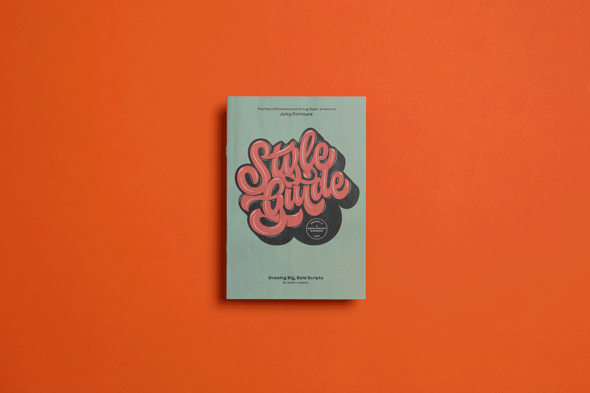
The newspapers have all been well received. I even snagged a few awards for my Style Guide (pictured above) and for one of the Twofold specimens. The Style Guide has been one of my top-selling products and offering a digital version alongside the newspaper has helped get it in the hands of people all over the world!
Mark's reading list for type lovers
Lettering Manual from Ken Barber
Dutch Type by Jan Middendorp
Type Addicted from Viction:ary
Where to buy Mark's newspapers
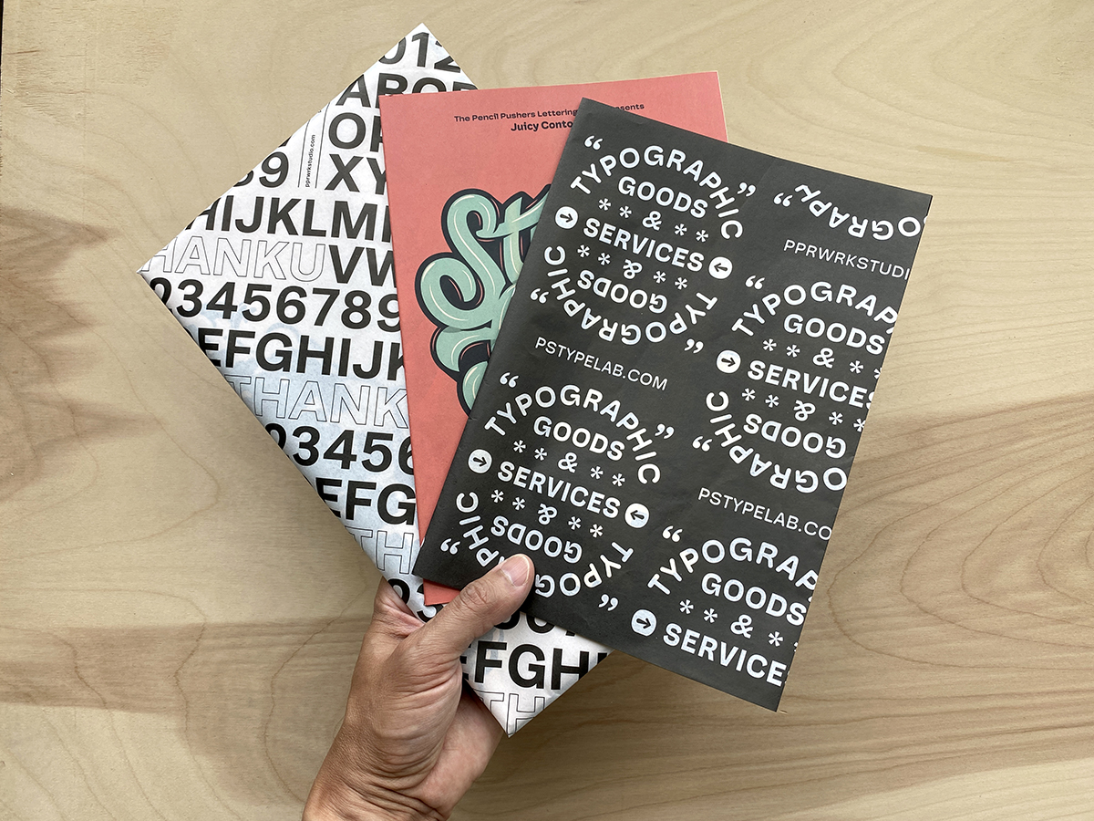
You can get copies of (most of) the newspapers mentioned above — plus many other other typographic treats — from Mark's online shop:
Extra Extra: A Quote Unquote Workbook focused on Emphasis, Embellishment & Exaggeration in Lettering
Thick and Thin: A Tremendously Unprecedented Type Specimen
Juicy Contours: A 16-page Style Guide for Drawing Big Bold Scripts
Twofold: Volume 5, Volume 4, Volume 3
Make your own newspaper with Newspaper Club. Print runs start at 1 copy!
If you’re looking to create a newspaper using Canva, you’re in the right place. We've been helping creative folks design and print custom...

Weddings are full of stories – how you got engaged, why you chose your venue or the flowers in your bouquet and all the little decisions...

So much thought goes into every part of your wedding, from the venue to the playlist to the colour of the napkins. But there’s only so...