
Risotto collects 400 joyful risograph postcards into a newspaper
Glasgow-based risograph studio Risotto has brought a global postcard project – featuring 400 illustrations by over 100 artists – together...
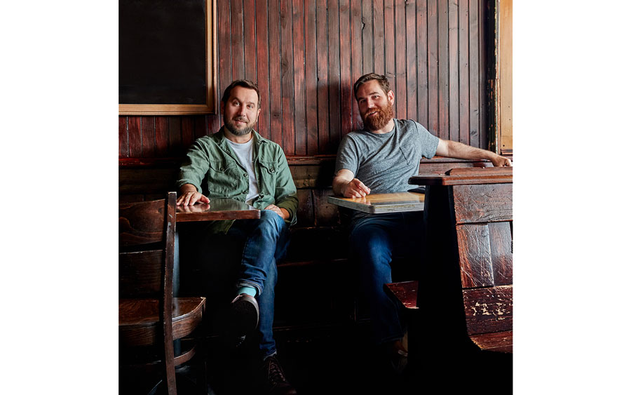
When they founded their creative agency The Heads of State in 2002, Jason Kernevich and Dusty Summers just wanted a break from their day jobs. "I don’t think we ever really intended for it to be a full-time design studio," Jason says. But today the pair, and their growing team, have plenty of work to stay busy, balancing branding projects for big clients like Nike and Starbucks alongside illustration assignments for The New Yorker and The New York Times.
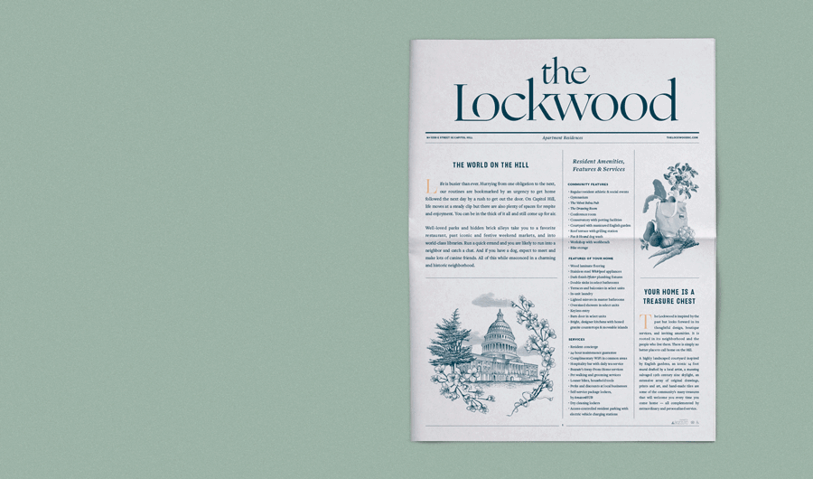
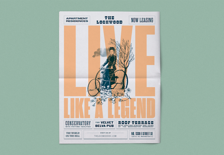
They recently used our traditional tabloids to create a "quirky tribute" to Belva Lockwood, a tricycle-riding suffragette who inspired the branding for a new apartment building in Washington D.C. "We felt that we were missing a huge opportunity if people moved into this apartment and didn’t learn about her," says Jason.
Below, Jason describes how The Heads of State has evolved over its 17-year history, the influence of poster artists on the agency's work, and why a newspaper was the best format to share the local history that inspired the branding of The Lockwood.
EARLY INFLUENCES
Dustin and I have been working together for 17 years. We both studied design at a fine arts university, Tyler School of Art in Philadelphia, and I think that’s crucial to how we view design. It wasn’t this Swiss, gridded design institution — it was much more free form and everyone really cared about posters and illustration. We took inspiration from artists like Milton Glaser and Seymour Chwast and had professors who came from the Polish poster tradition.
I think that education set us on a particular path. At the heart of our work is probably a love of image-making and a certain sensibility around illustration and how it can be dialled up or dialled down depending on the project.
SETTING UP THE HEADS OF STATE
When we started The Heads of State it was more of an art project, and I don’t think we ever really intended for it to be a full-time design studio. It started as a break from our day jobs. We were 23 years old and really interested in screenprinting and music — music was the most important thing to us in the world.
We made a ton of band posters together between 2003 and 2006 and the timing was really good for that. People were in a Y2K hangover and were craving stuff that felt handmade and rough around the edges, and that was very much our sensibility.
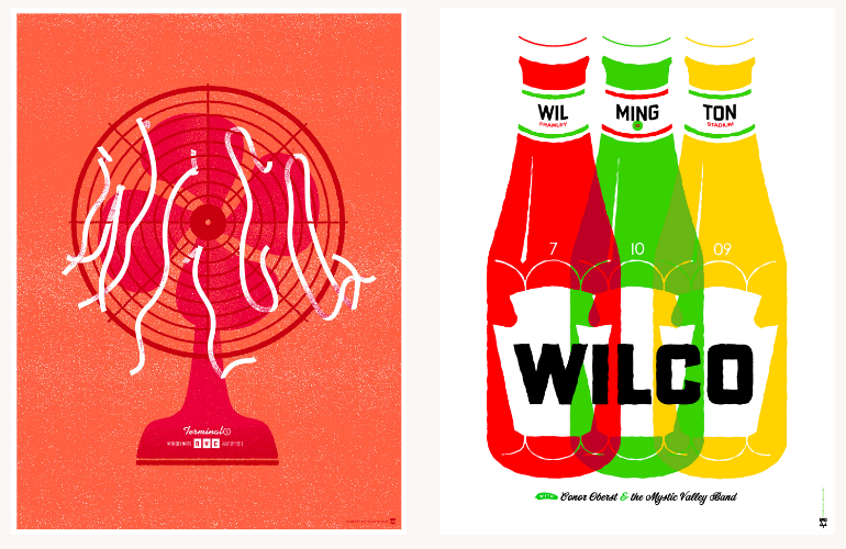
We had been designing posters and band merch for local bands and people we knew, but in 2004 we started doing tour posters for Wilco. They had been on a run with amazing records at that time. Our work had a rough-hewn, Americana feel and it was a really good match for a band like that — traditional at its root but always trying to come up with interesting twists on what tradition is.
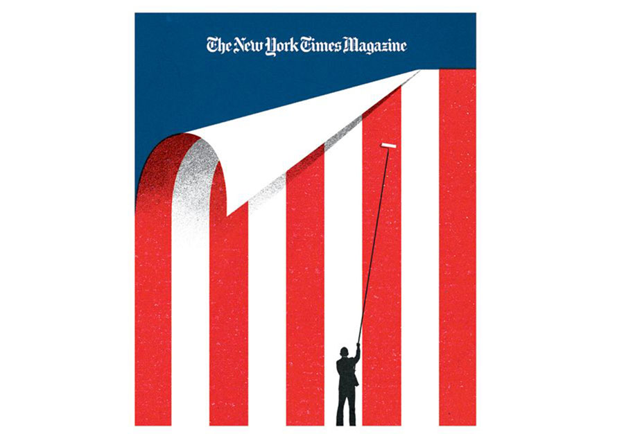
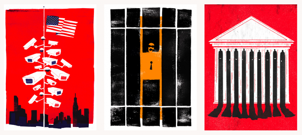
Working with Wilco helped catapult us into visibility. We got more work designing posters, which then led to things like book covers. In 2017 we got to work with Penguin to update a set of John Steinbeck classics. We’ve also done various pieces for The New York Times, including a cover for the Sunday magazine following the inauguration of President Barack Obama (pictured above).
Illustration and book covers can be a real churn and burn industry. You’re doing a few per week if you work in editorial illustration. We loved that problem solving challenge, but the pace was not sustainable and eventually we got burned out. We love that work, but we’re restless individuals.
A CHANGE OF PACE
We’ve never been very enterprising, we’ve always maybe zigged when we should zag. Once we had a studio and some clients, we immediately started trying to change the kind of clients we work for, which is probably not smart business but it’s kept us interested the whole time.
Over the past 5 years we’ve been focusing on branding, which is its own kind of challenge. As you get older in this field you have to make choices about how much you want to be a maker versus how much you want to be a director. Branding seemed like a great way to combine everything. We were looking for clients who had bigger budgets and bigger scope that would allow us to spend more time on a project.
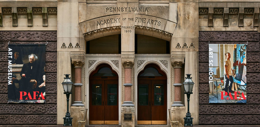
So when you start to explore that you are led to different types of clients, some of them more corporate and some more arty. We try to strike a good balance — recently we’ve redesigned the graphic identity for The Pennsylvania Academy of the Fine Arts (pictured above) and worked on the name and branding for the fast-casual restaurant Immigrant Food.
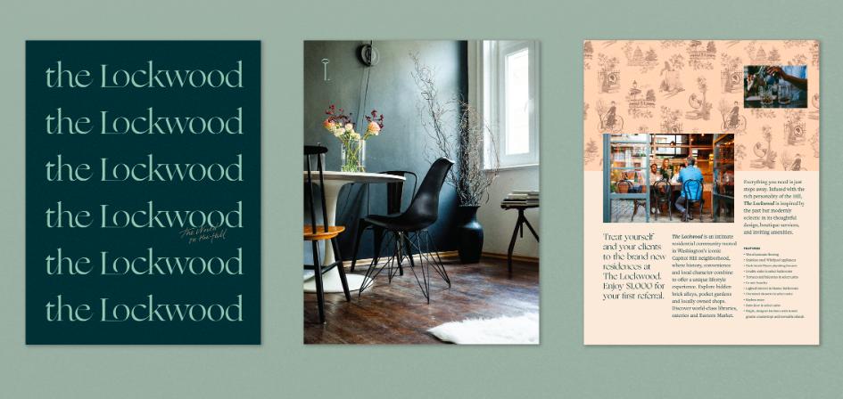
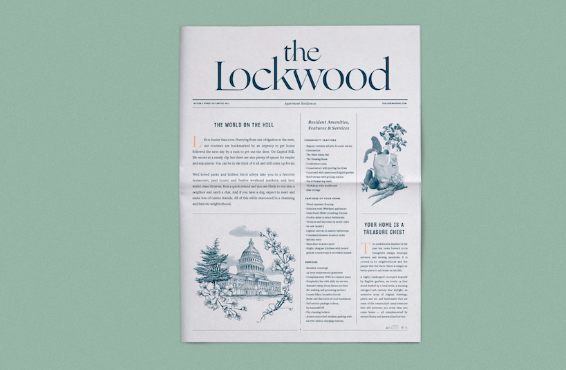
THE LOCKWOOD
The project we printed with Newspaper Club is such a departure from anything we did in the first 10 years of our studio, but it was a wonderfully interesting challenge. It came to us through some personal work we had done that was all about Art Deco typography. It’s really nice when a client comes to you because of something you did that was personal and artistic.
The Lockwood is interesting — you look at it one way and it’s just a luxury apartment building in Washington D.C. At first the project seemed dry and not super interesting to us. But it turns out the developer who did this project does wonderful boutique projects with great backstories and this particular one is about a woman named Belva Lockwood.
Belva was an early suffragette and human rights activist. She was the first woman to argue a case in front of Congress and she ran twice for president. She was quite a character. She rode this crazy tricycle around Capitol Hill in velvet dresses. They wanted to build this building in her honour and when I heard that it was enough for us to want to take on the project.
TELLING BELVA'S STORY
As you’re trying to market an apartment building, there are so many common ways that it’s done — there are folders and flyers and leave-behinds about amenities and floor plans and all that stuff. But that just didn’t seem right for this project and for someone as interesting as Belva. That’s why we started to think about how to create a newspaper.
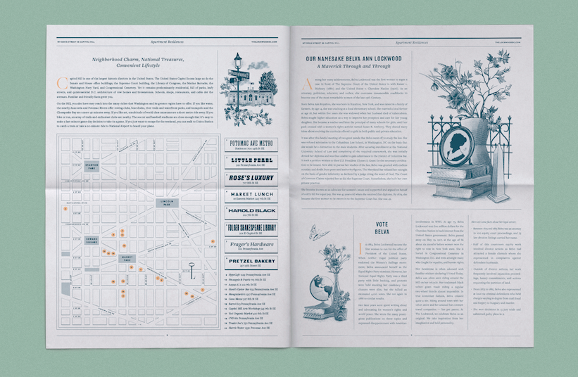
We felt that we were missing a huge opportunity if people moved into this apartment and didn’t learn about her. The newspaper was the way to condense her story, and then it also became a history of Capitol Hill as a neighborhood with a map and list of local amenities.
The first choice we made that was probably unexpected was to bring in an illustrator. We always want our work to contain a fair amount of illustration. And as much as we love illustration and do it ourselves, it’s so much fun to be able to hire illustrators and art direct them. We hired Dan Funderburgh to do the Victorian-style portraiture and details.
The Lockwood is using the newspapers in a couple different ways: when they show the model rooms they have them available to take away, and they’re also including them in their welcome packet for new tenants. It’s this super useful leave-behind for a tenant, which works as a marketing tool, but we felt a responsibility to make it not feel like marketing at all. We wanted to make it about the great things in the neighborhood and the story of Belva.
A newspaper has the benefit of being the only non-shiny, slick piece of collateral that’s given to someone looking for an apartment in a big city. I think discovering something after you bring it home, and it’s sitting in this stack of papers that you collected over your busy day, and you’re like ‘Oh wait, this is what this is?’ I think that has a more lasting effect, when you get to read it at your leisure and spend time with it and be surprised by it.
Print your own newspaper with Newspaper Club.
Glasgow-based risograph studio Risotto has brought a global postcard project – featuring 400 illustrations by over 100 artists – together...

More than 150 photographers gathered in London last week for Photo Meet, an annual portfolio review that brings together photographers...

Email newsletters weren't cutting it for photographer and creative director Max Hemphill. "Most of my outreach got lost in inboxes," says...