
Risotto collects 400 joyful risograph postcards into a newspaper
Glasgow-based risograph studio Risotto has brought a global postcard project – featuring 400 illustrations by over 100 artists – together...
The renowned graphic designer Herb Lubalin (pronounced lou-BAH-lin) would have turned 100 years old this year. To mark the occasion, the Herb Lubalin Study Center at Cooper Union launched a 100-day project – starting on Lubalin's birthday, 17 March – reexamining his work and legacy.
Lubalin is celebrated for designing the influential publications Eros, Fact and Avant Garde. He also co-founded the International Typeface Corporation (ITC) and produced U&lc, considered the first magazine for typographers (it was printed on newsprint!)
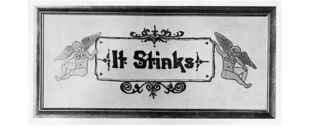
Lubalin 100 brings new context to these career highlights, and also reveals rarely seen aspects of Lubalin's life – like a sign he kept in his studio embroidered with a favourite phrase: "It stinks".
Objects like this "tell a richer story about Herb Lubalin as an individual," says Alexander Tochilovsky, curator of the Lubalin Center. The goal of Lubalin 100 is to "help the public see beyond the surface of his design work and understand the essence of his ingenuity."
We were excited to partner with the Lubalin Center to produce a newspaper for Lubalin 100, showcasing a special piece of typographic history.
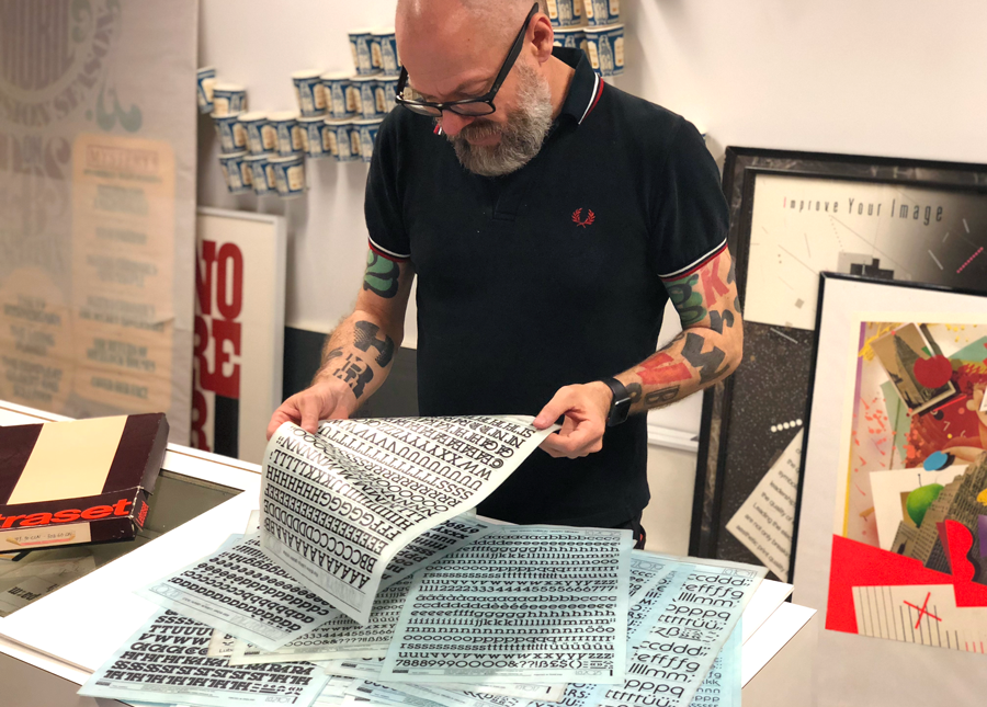
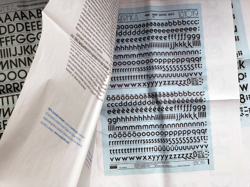
Dan Rhatigan (pictured above) is a Senior Manager at Adobe Type and longtime friend of the Lubalin Center. For years he’s collected examples of Lubalin's typefaces printed on Letraset, a now obsolete form of dry-transfer lettering invented in the 1960s. “Basically, you could scribble over a letter on a sheet of the Letraset, and transfer that letter to paper,” explains Rhatigan.
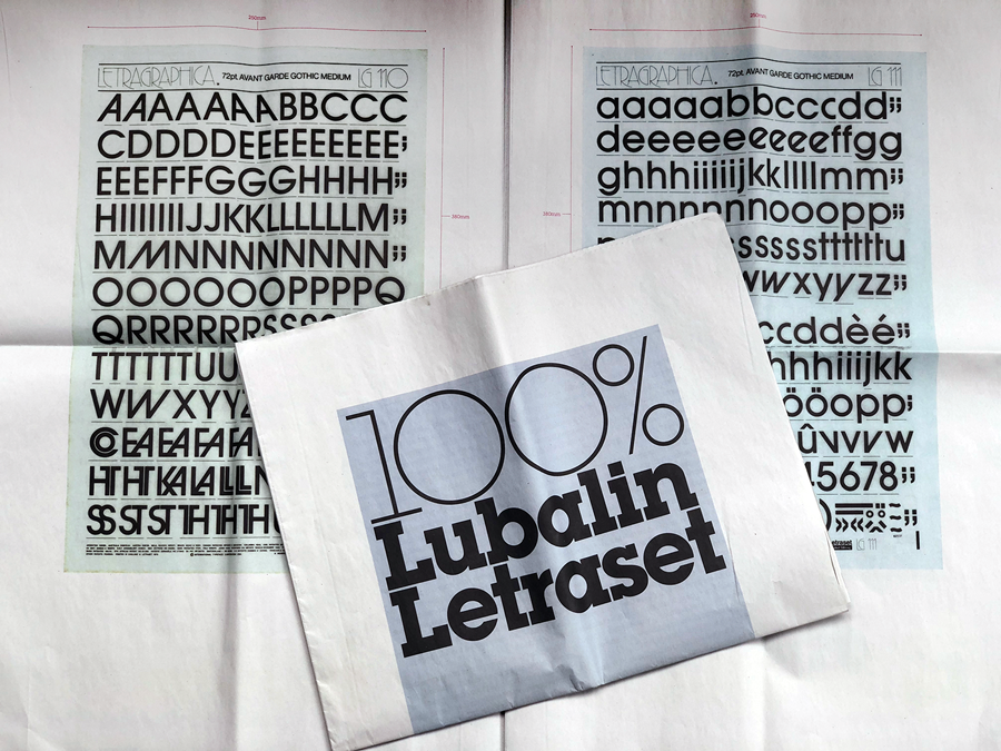
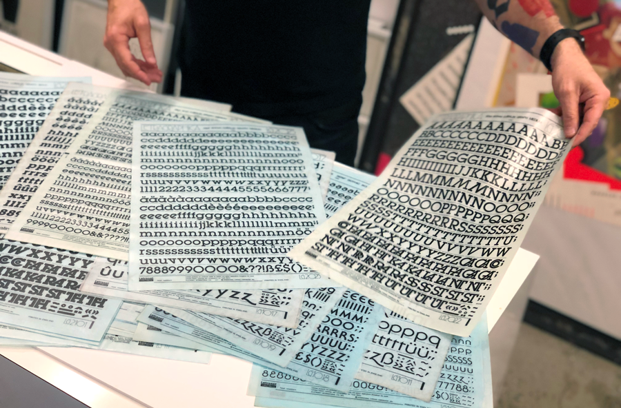
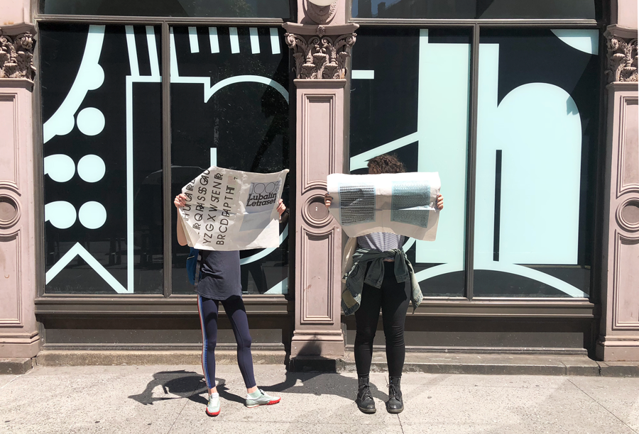
100% Lubalin Letraset, designed by Rhatigan and printed as a traditional broadsheet, features 17 pristine sheets of Letraset from Rhatigan’s collection reproduced at actual size.
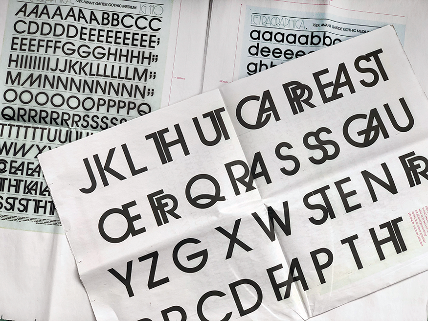
The newspaper includes Letraset sheets for one of Lubalin's most famous typefaces, Avant Garde, which you've seen if you've ever watched the series Twin Peaks.
Another typeface, ITC Lubalin Graph, was designed by Lubalin in 1974 and has been used on everything from ads for corn flakes to Frank Zappa's stationery.
"One of the things I love on these Letraset versions is that Lubalin Graph originally came with all of these alternates and ligatures that never made it into the digital typefaces," Rhatigan told us. "So you only see what the full design looks like on the Letraset."
The Letraset sheets "may be nostalgic for an older audience and curious to those who have only used these typefaces digitally," writes Rhatigan in his introduction to the newspaper. The glyph styles, especially, "suggest possibilities that were more readily apparent to designers in the past than to those of us working with them today."
The newspaper was released on Day 90 of Lubalin 100 and included in goodie bags for Cooper Union's annual Typographics conference, which took place 15 - 16 June in New York City. Lubalin 100 will conclude on 24 June 2018.
Print your own newspaper with Newspaper Club.
Glasgow-based risograph studio Risotto has brought a global postcard project – featuring 400 illustrations by over 100 artists – together...

More than 150 photographers gathered in London last week for Photo Meet, an annual portfolio review that brings together photographers...

Email newsletters weren't cutting it for photographer and creative director Max Hemphill. "Most of my outreach got lost in inboxes," says...