
Risotto collects 400 joyful risograph postcards into a newspaper
Glasgow-based risograph studio Risotto has brought a global postcard project – featuring 400 illustrations by over 100 artists – together...

Few publications have aged as gracefully as The New York Times Magazine. Originally printed as a broadsheet, it was introduced to newsstands in 1896 as the Sunday Magazine Supplement and featured the first photos ever to run in The New York Times.
These days the magazine has around 3.2 million digital and print subscribers. But as the way people consume news has changed, so has the magazine's purpose within the Times.
“When [people are] reading a magazine, they’re looking for a very different experience,” explains design director Gail Bichler. "They want something that will be more leisurely, possibly something that might entertain them – a curated experience.”
With this in mind, Bichler and art director Matt Willey (who is also a co-founder of Port Magazine) led an extensive redesign of the magazine in 2015. As part of the project, Henrik Kubel of London-based A2-TYPE was tasked with designing a new suite of “modern fonts, rooted in history.”
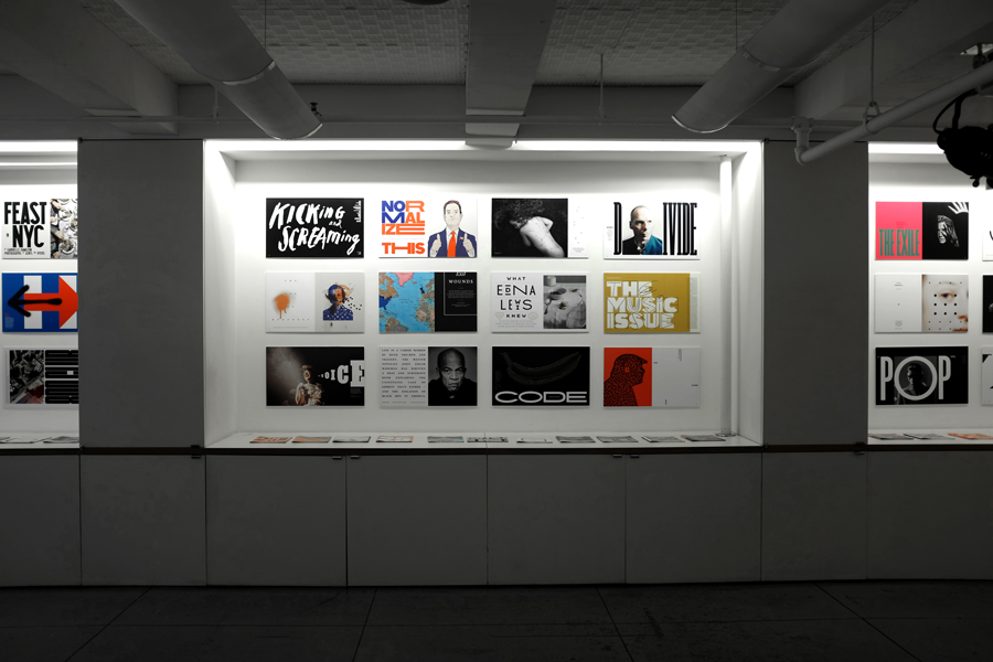
In the end he came up with 29 custom fonts – a process Kubel likens to “playing many different instruments" – and they’re the cornerstone of a new exhibition at the Type Directors Club in New York.
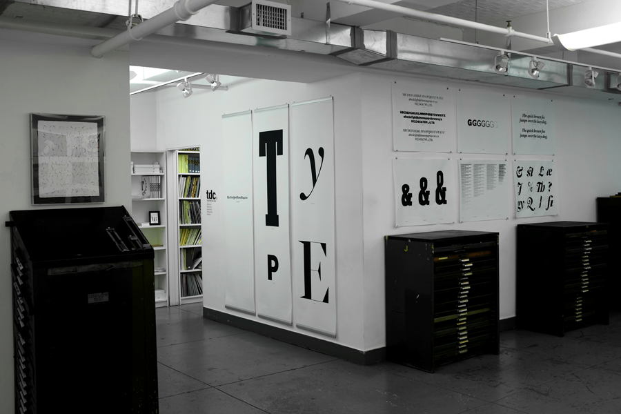
"The New York Times Magazine Type: 2015–Present" showcases some of the most memorable covers, spreads, and special issues featuring Kubel’s fonts, plus other bespoke typography created by the magazine’s art department and freelance contributors.
From a whole issue turned on its side to drop caps resembling animals, it’s a staggering collection of work highlighting the interplay of type, illustration and photography that sets The New York Times Magazine apart.
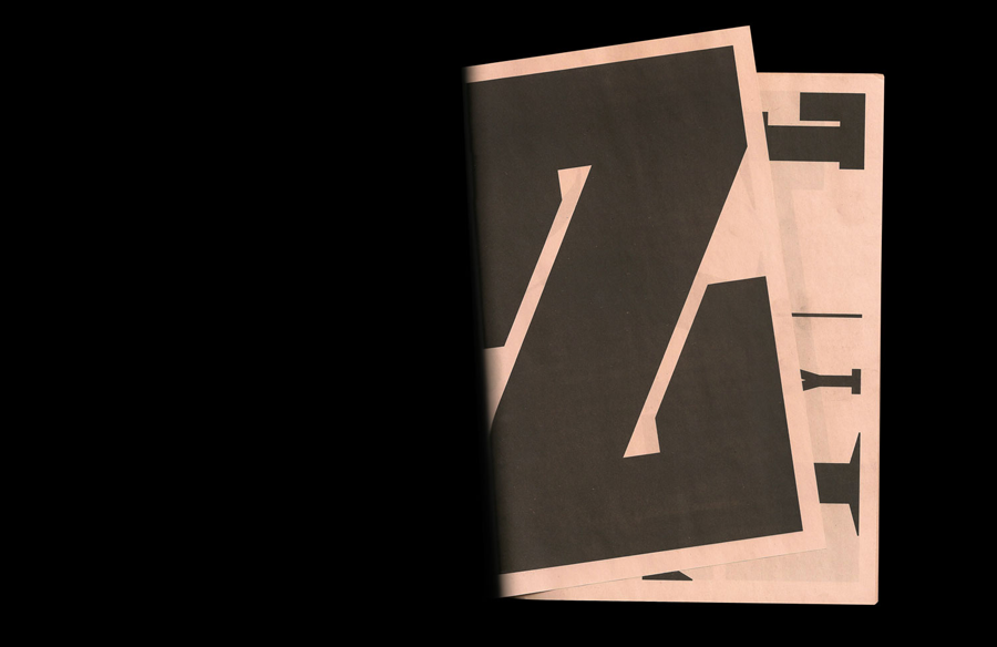
As a complement to the exhibition, Bichler and her team designed a newsprint type specimen that visitors could take with them. It's a traditional mini on salmon newsprint:
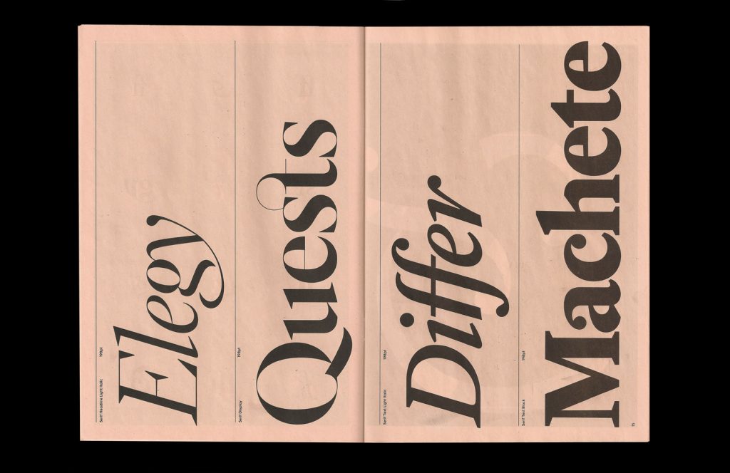
"The design of The New York Times Magazine doesn’t use of a lot of ornamentation or flourishes," writes Bichler in the introduction to the newspaper. Similarly, they approached the 40-page specimen with restraint: "We kept it classic and printed the whole thing in black," Bichler says. "But opted for the salmon newsprint to give it a pop of color."
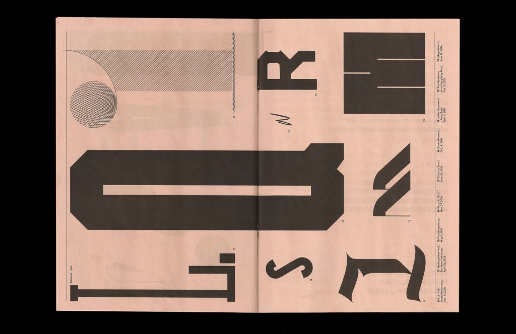
"Coming up with the language for the specimen was a challenge," she adds. "We thought of a number of different solutions including using headlines from past features in the magazine as the type, but ultimately decided just to use words and characters that best allowed us to show off the most beautiful and unique features of our fonts."
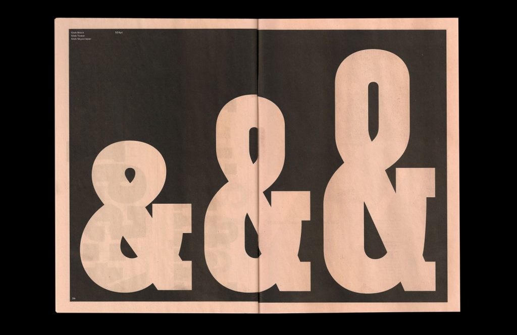
Like everything from The New York Times Magazine, the final result shows serious attention and thought – and a bit of playfulness, too. Says Chloe Scheffe, a designer at the magazine who worked on the specimen: "My favorite part is that it begins with 'A' on the inside front, and ends with 'Z' in the inside back – effectively making the whole thing an alphabet."
"The New York Times Magazine Type: 2015–Present" ran from 1 June – 5 September 2017 at the Type Directors Club.
Print your own newspaper with Newspaper Club.
Glasgow-based risograph studio Risotto has brought a global postcard project – featuring 400 illustrations by over 100 artists – together...

More than 150 photographers gathered in London last week for Photo Meet, an annual portfolio review that brings together photographers...

Email newsletters weren't cutting it for photographer and creative director Max Hemphill. "Most of my outreach got lost in inboxes," says...