

From festivals to conferences: 11 ways to elevate events with a newspaper
Planning an event and want to add that extra touch to engage and inspire your guests? Look no further than an events newspaper! There's...
The third issue of the Lecture in Progress newspaper launched this month, and it coincides with the platform's first birthday. In the past year, Lecture in Progress has distributed over 20,000 copies of their first two tabloids across the UK, sharing the stories behind projects like linocuts for The New Yorker and food fights with Harry Styles. (The newspapers were also included in our exhibition at OFFSET Dublin!)
For this latest edition, which features popular articles recently published on the site, Lecture in Progress worked with Bristol-based agency Kaleido Grafik. Kaleido Grafik co-founders Pete Dungey and Miles Gould tell us about the design process, from choosing new typefaces to creating a set of stickers to accompany the newspaper.
Edition three underwent a design overhaul with readability at the heart of our approach. We decided to review the existing grid system, fonts, page detailing and colour palettes. We focused on improving the signposting of articles by creating large typographic headers, and introduced two new fonts: NSW01 (by Matt Willey) and Apercu Mono (by Colophon Foundry) for their confident, impactful and textural qualities. The new fonts, coupled with the existing New Transport and Antwerp (by A2) were key to the improved signposting throughout the newspaper.
Column width and lengths underwent subtle changes, along with tweaks to line spacing and typesetting, to help make articles more readable. A pared-back black and white typographic design allowed the supporting article content to speak for itself, and bring their colourful energy to the page. The grid was also reworked to add flexibility to the layouts. Finally, we proposed reshuffling certain content, to help improve the balance and variety within the content flow.
We worked hard to ensure that key information about all the amazing features and Lecture in Progress’ founding principles were more visible, simple and engaging, to help the next generation of creatives better understand what’s up for grabs.
We’ve worked with newsprint on a number of occasions. Part of the appeal for us is that it encourages real engagement from whoever is in possession of it – the effort to pick it up, the crackle as you turn the pages, the sound, the smell of fresh ink. The physical presence of a newspaper commits you to reading it in a far more obtrusive, unforgettable way than a half-hearted Google search.
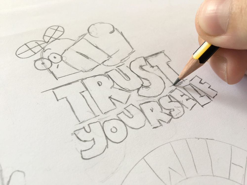
One of the biggest creative challenges was creating a visual concept around something that’s not particularly tangible. We transported ourselves back in time to remember the dread of your first real test of responsibility within a professional creative workplace. The smallest of tasks can feel akin to being asked to transport a Fabergé egg on a penny-farthing through Bank tube station during Monday morning rush-hour. However, the more experience you gain, the more the confidence builds, and the easier it is to battle those internal monologues of “I can’t do this” or “I’m not good enough.”
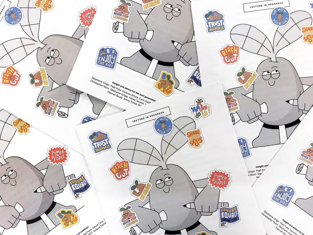
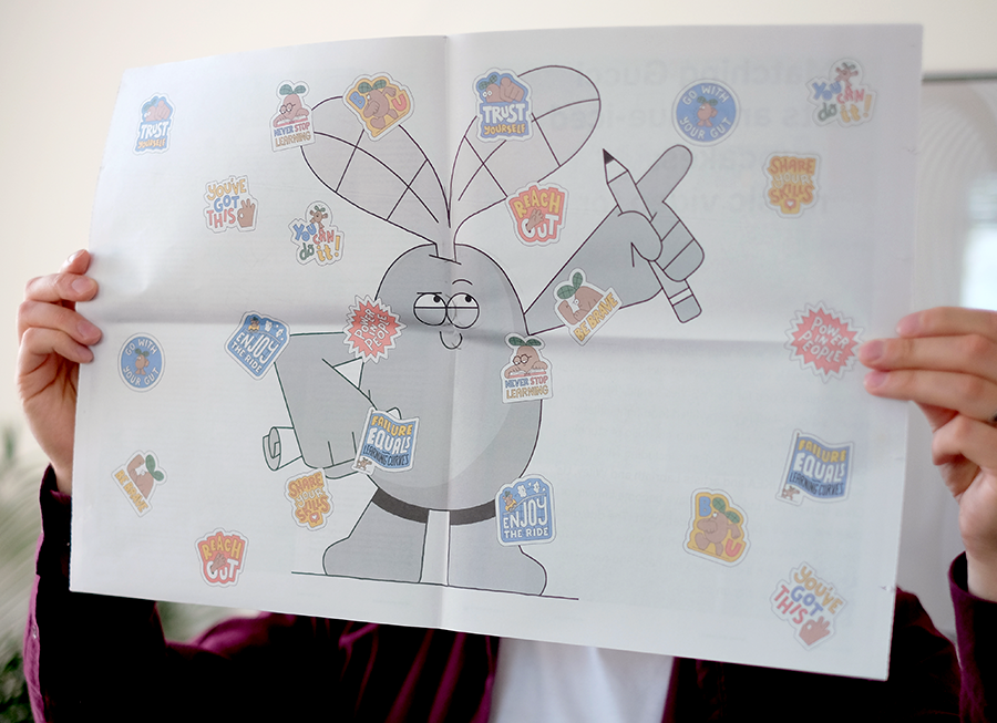
We came up with the idea of a sticker set which communicated key positive affirmations, which creatives could use within their own work environments, to help build or re-enforce self-belief. Humour felt like a natural device to take the edge off the associated horror connected with self-doubt. We wanted to try and disrupt the pessimistic thoughts someone lacking confidence might feel.
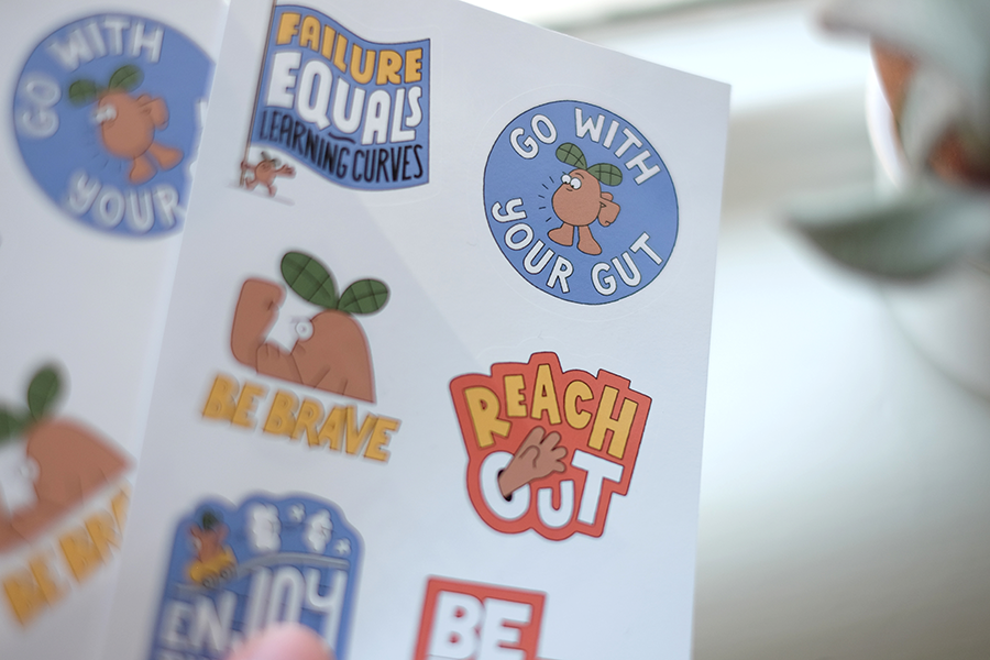
We decided to approach Dan Woodger (a fellow Brighton graduate) for the illustrations. We follow Dan on Instagram, and have always really enjoyed his work; he has a great knack for observational humour. We felt his graphic lettering and simplified characters would lend themselves perfectly to the constraints of a sticker, as they could be reduced in size and still work well. His experience of illustrating for clients such as Google and Netflix meant we were in safe hands.
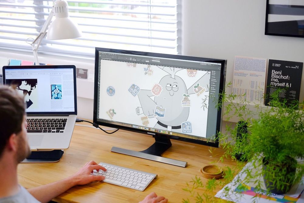
Dan started by sketching out concepts in pencil for the stickers and spot illustrations which would eventually be used on the cover and centre spread. The sketches were reviewed by us internally and the Lecture in Progress team, to allow for feedback and thoughts before being taken into a digital space, drawn and coloured in Photoshop.
Initially we proposed the idea of a geometric character, however this approach changed through discussions with Dan, after deciding that it would be nice to inject some meaning into the character. Dan’s idea was to illustrate a character based on a seed, to allude to the beginning of a creative’s professional career. The leaves actually provided a lovely opportunity to add expression into the character, especially on the rollercoaster with the wind rushing through them.
The project was very collaborative. All project communication was undertaken over email and on the phone due to the fact that we are in Bristol, and the Lecture in Progress team are in London. We know the Lecture in Progress team well (from our Brighton student days) so the process was very open, collaborative with trust to let us do our thing. Will had an open brief: To take what currently existed and put our mark on it. The theme of edition three was trusting yourself and self-belief. It wasn’t really a case of total reinvention, as the newspaper has already built a strong brand presence, so it was more a matter of taking what assets were available and amplifying them.
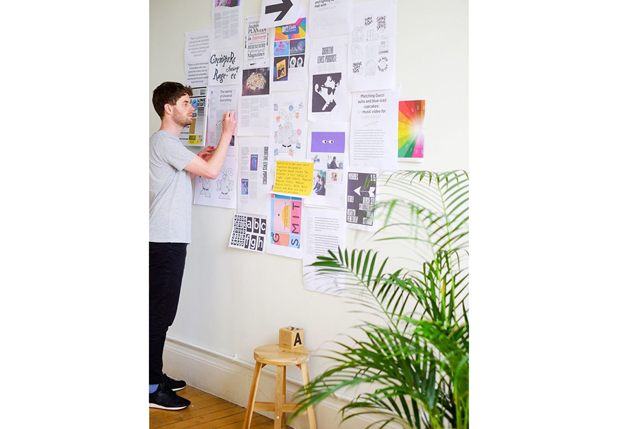
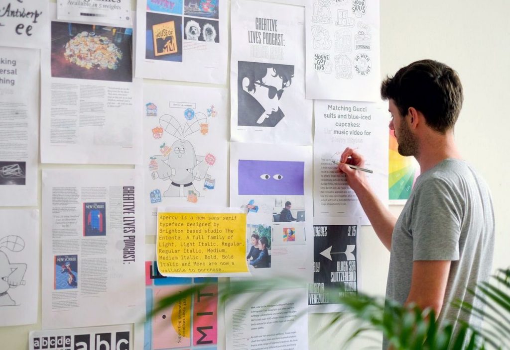
For all projects, we have a dedicated space to pin works in progress – colours, fonts, illustrations, tone of voice and iconography, to create a visual moodboard that allows us to immerse ourselves in the developing graphic voice. We find this useful as it takes the macro detailing we’re creating on our screens, onto a much larger canvas that feels more experiential. It also provides an opportunity for other team members to add or feedback on what’s happening at any point during the project.
The sample newspaper was really useful in terms of having accurate re-production guidelines for key elements such as colour, key lines and type sizes.
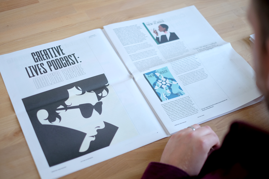
We’re big fans of Malika Favre’s work, simple, bold and colourful. Her feature is our favourite spread in the latest newspaper edition as well as feature on the Lecture in Progress website. There’s a short film which walks you through the vivid mind of Malika and her illustrative process.
Miles: On a Sunday morning, in my wife’s family's sunroom, which overlooks their garden and the Jurassic Coastline.
Grab your own copy of the Lecture in Progress newspaper from select stockists across the UK.
Print your own newspaper with Newspaper Club.
Planning an event and want to add that extra touch to engage and inspire your guests? Look no further than an events newspaper! There's...

Our tabloid is by far our most popular size of newspaper, and with good reason. It's perfect for comics, catalogues, photobooks... The...

“Newsstands appear in the work of almost every great photographer,” writes Edwin Heathcote in the Financial Times. “They are the...